Product Ads
Smart Tumbler Features Ad
3:40 likesProduct AdsCinematic
Prompt
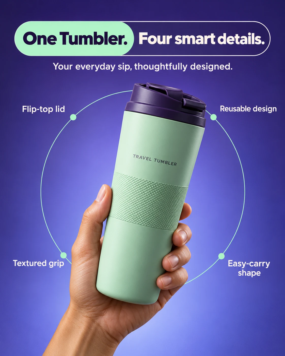
Create a polished product advertising poster with a hand-held hero product, a bold split headline banner, and four feature callouts arranged around a thin circular outline. Combine realistic product photography with clean, precise graphic design.
Use a NEW product, not the supplement tube shown in the reference. Include the advertising text specified below. Do not include any brand name or logo.
OPTIONAL CUSTOMIZATION
• Product: [Automatic if unspecified]
• Headline: [Automatically match the chosen product]
• Supporting sentence: [Automatically match the chosen product]
• Four feature callouts: [Automatically match the chosen product]
• Palette: [Deep violet, soft periwinkle, fresh mint, warm white]
• Aspect ratio: [4:5 portrait]
PRODUCT SELECTION
If a separate product photograph is attached, use its shape, proportions, materials, and colors. For this design, remove brand names and logos from the visible packaging while retaining a believable generic product label.
If written product details are supplied without a photograph, create the product from those details.
If neither is provided, proceed immediately with the default concept below. Do not ask for clarification.
Use any attached advertisement only as a visual layout reference. Do not reuse its product, brand, copy, or health claims. Ignore unchanged placeholders and never print template instructions.
DEFAULT NEW PRODUCT
An unbranded reusable travel tumbler with a matte pale-mint body, a dark violet flip-top lid, and a subtly textured grip band. Choose a slim, ergonomic form that one adult hand can comfortably hold. Include a tiny generic label reading “TRAVEL TUMBLER,” with no logo or decorative brand symbol.
Use these exact words for the default design:
Headline, first segment:
“One Tumbler.”
Headline, second segment:
“Four smart details.”
Supporting sentence:
“Your everyday sip, thoughtfully designed.”
Four callouts:
“Flip-top lid”
“Reusable design”
“Textured grip”
“Easy-carry shape”
If the user specifies another product, rewrite all copy to fit that product. Keep the same short headline structure and exactly four concise callouts. Use supplied facts or visibly demonstrable design features; do not invent health benefits, certifications, performance figures, or guarantees.
LAYOUT
Create a strong vertical hierarchy:
• A wide rounded headline banner across the upper portion.
• One short supporting sentence beneath it.
• A large hand-held product dominating the middle and lower portions.
• Four feature callouts surrounding the product along a delicate circular outline.
Use approximately 6–8% outer margins. Keep the top margin clean without a logo or an empty reserved logo area.
HEADLINE BANNER
Place the headline inside a long horizontal capsule approximately 88% of the canvas width. Its left section has a solid fresh-mint fill with bold dark-violet text. Its right section has a transparent violet background with a fine warm-white outline and bold warm-white text.
Let the mint section occupy approximately 42% of the banner. Adjust type size so both headline segments fit comfortably with generous internal padding.
Use a heavy contemporary sans-serif with clean letterforms and tight but readable spacing. Keep both segments aligned on the same baseline. Do not add a tablet, pill, or supplement icon between the segments.
Place the supporting sentence below the banner in smaller, medium-weight warm-white sans-serif text, centered with comfortable separation.
HERO PHOTOGRAPHY
Show one realistic adult hand rising from the bottom edge and holding the tumbler around its lower half. Place the product slightly right of center, with its top leaning subtly toward the right by approximately 8–12 degrees.
Keep the lid and product silhouette fully visible. The tumbler should occupy approximately 48–55% of the canvas height. Position the thumb naturally along one side, with the remaining fingers wrapping around the opposite side. Preserve believable anatomy, contact pressure, fingernails, skin creases, and warm skin tones.
Keep the hand and product sharply resolved. The grip should reveal the textured band and avoid covering the generic product descriptor.
CIRCULAR FEATURE GRAPHIC
Place one thin mint circular outline behind the product, centered around its middle. Make the circle approximately 65–70% of the canvas width. Hide the line naturally where the opaque hand and product overlap it.
Add four small solid mint dots on the circle at roughly the upper-left, upper-right, lower-left, and lower-right positions. Place one callout just outside each dot:
Upper left: “Flip-top lid”
Upper right: “Reusable design”
Lower left: “Textured grip”
Lower right: “Easy-carry shape”
Use warm-white sans-serif text, medium weight, with no more than two lines per callout. Align the left callouts consistently and balance the right callouts against them. Keep all text clear of the hand, product, headline, and canvas edges. The dots are decorative feature markers, not technical pointers to specific product parts.
BACKGROUND AND COLORS
Use a seamless violet-to-periwinkle gradient, slightly darker at the top and brighter toward the lower center. Add extremely subtle fine grain to avoid a flat digital appearance.
Use mint for the headline highlight, circular outline, and four dots. Use warm white for supporting text and callouts. Preserve strong contrast and restrained color coordination.
Keep the reference’s overall visual structure recognizable while changing the product category, palette, banner proportions, product tilt, and callout spacing. Avoid unnecessary redesign or extra decorative elements.
LIGHTING AND REALISM
Light the hand and tumbler with a broad soft source from the upper left. Create realistic highlights on the lid, gentle shading across the matte body, and soft contact shadows between the fingers and product.
Maintain fine skin texture and a believable material finish. Add subtle violet ambient reflection along shaded edges so the photograph feels integrated into the colored setting. Avoid heavy cutout shadows or glowing outlines.
TYPOGRAPHY AND OUTPUT
Render all specified copy accurately with clean spelling, consistent baselines, and crisp letterforms. Prioritize headline readability, followed by the product and then the four callouts.
Produce one complete, finished advertising poster. No mockup frame, presentation slide, explanation, or alternate layouts.
AVOID
Brand names, logos, the original supplement product, copied reference slogans, medical claims, extra callouts, gibberish text, crowded typography, tiny unreadable lettering, additional hands, distorted fingers, warped packaging, excessive shadows, busy textures, and watermarks.