Beauty & Wellness
Satin Body Oil Ad
3:40 likesBeauty & WellnessCinematic
Prompt
Create a premium botanical product advertisement with one central hero bottle, monumental typography behind it, a richly colored studio setting, and carefully arranged natural props. Combine photorealistic product photography with refined editorial typography.
Use a new product instead of the vitamin C serum in the reference. Include matching advertising copy, but no brand names or logos.
OPTIONAL CUSTOMIZATION
• Product: [Automatically select if unspecified]
• Hero word: [Automatically match the product]
• Main palette: [Deep plum, dusty mauve, warm ivory]
• Accent metal: [Brushed champagne gold]
• Aspect ratio: [4:5 portrait]
AUTOMATIC PRODUCT SELECTION
If a separate product photograph is attached, use its shape, proportions, materials, and packaging colors. Remove visible brand names and logos for this design.
If written product details are supplied without a photograph, create the specified product.
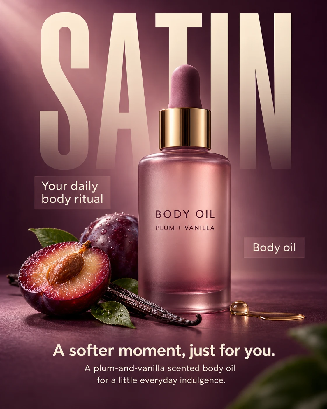
If neither is provided, automatically choose a suitable premium personal-care product and proceed without clarification. Default to an unbranded plum-and-vanilla scented body oil in a frosted mauve glass bottle with a champagne-gold dropper collar and soft mauve rubber bulb.
Treat the attached advertisement as a visual reference only. Do not reproduce its serum, branding, exact copy, or ingredient claims. Ignore empty fields and unchanged placeholders; never print template instructions.
DEFAULT ADVERTISING COPY
Large background word:
“SATIN”
Left callout:
“Your daily
body ritual”
Right callout:
“Body oil”
Bottom headline:
“A softer moment, just for you.”
Bottom supporting copy:
“A plum-and-vanilla scented body oil
for a little everyday indulgence.”
Generic bottle label:
“BODY OIL”
“PLUM + VANILLA”
If another product is supplied, automatically adapt every text element to it. Use a short, expressive background word, two compact callouts, one headline, and one brief supporting sentence. Include only supplied product facts; do not invent concentrations, clinical results, volumes, or certifications.
HERO COMPOSITION
Place one upright bottle near the center, slightly right of the vertical axis. Keep the entire bottle visible, including the dropper bulb and base. Make it approximately 60% of the canvas height.
Photograph from a slightly low, nearly front-facing viewpoint so the bottle feels substantial and premium. Preserve clean verticals and accurate proportions.
Set the bottle on a matte plum-colored surface that blends seamlessly into the background. Create a realistic contact shadow beneath its base and a faint, restrained surface reflection.
Arrange the visual hierarchy as:
• Oversized background word across the upper half.
• Central product overlapping the lettering.
• Small callouts flanking the product.
• Natural props around the base.
• Centered headline and supporting copy near the bottom.
BACKGROUND TYPOGRAPHY
Set “SATIN” in extremely tall, condensed uppercase sans-serif lettering spanning approximately 85% of the canvas width. Position it close to the top edge and extend it downward behind the bottle’s shoulders.
Use muted warm ivory with reduced opacity and a subtle fade toward the bottom. The word should remain readable while functioning as part of the background.
Layer the bottle clearly in front of the letters. Keep the lower headline and callouts separate from this background type.
PRODUCT MATERIALS
Render the default bottle in frosted mauve glass with softly rounded shoulders, a stable cylindrical base, and subtle translucency at the edges. Show believable glass thickness and a slightly darker liquid tone near the bottom.
Use a polished champagne-gold collar with controlled vertical reflections. Render the rubber dropper bulb with a soft matte finish and natural rounded form.
Keep the front label minimal, using only the specified generic product descriptor and scent name in dark plum. No logo, brand-like emblem, decorative seal, or invented fine print.
If a product photograph is provided, preserve its materials and colors instead of imposing the default bottle design.
BOTANICAL PROPS
Place one ripe plum half and one smaller whole plum behind the bottle’s lower-left side. Show realistic fruit skin, flesh, and a believable stone.
Lay a single vanilla pod diagonally beside them, with one or two restrained green leaves near the surface. These props communicate the fictional default scent, not an unsupported ingredient formulation.
Place a small clear oil bead and a subtle thin oil smear near the bottle’s lower-right side. Keep them physically plausible, with realistic viscosity, surface tension, and specular highlights. Avoid oversized glass-like spheres.
Add one softly blurred foreground leaf entering from the lower-right edge to create depth, without covering the text or product.
If another product is selected, adapt the props to its supplied ingredients, scent, or use. Omit ingredient props when their relevance is unknown.
SMALL CALLOUTS
Position the left callout beside the bottle’s upper body, using warm-ivory type on a subtle translucent mauve rectangular highlight.
Place the right callout beside the lower-middle of the bottle, slightly above the props. Use a similarly restrained panel with generous padding.
Keep both callouts compact, balanced, and clear of the bottle silhouette. Do not add arrows, icons, badges, or extra feature lists.
LIGHTING AND ATMOSPHERE
Use a soft but directional key light from the upper left, creating a luminous area in the background and gentle diagonal light falloff.
Keep the outer background deep plum, transitioning into a lighter dusty-mauve glow behind the bottle. Introduce subtle atmospheric softness without visible smoke or exaggerated light rays.
Add delicate rim separation along the glass, realistic highlights on the metal collar, and natural shadows around the fruit and leaves. Preserve detail in darker areas.
Maintain sharp focus on the bottle and nearby props, with a softly defocused background and foreground leaf.
BOTTOM COPY AND FINISH
Center the bottom headline in medium-weight warm-ivory sans-serif. Place the supporting sentence below in smaller regular-weight type, arranged across two or three balanced lines.
Leave enough space beneath the product so the copy does not overlap the bottle, props, or contact shadows. Maintain at least 5% safe margins.
Preserve the reference’s luxurious botanical mood, oversized background word, central bottle, side callouts, and lower copy. Introduce controlled changes to the product, palette, prop arrangement, and spacing.
Output one complete, polished advertising poster with accurate text and realistic materials.
AVOID
Reference branding, vitamin C serum claims, green-and-orange duplication, invented efficacy claims, extra logos, illegible packaging text, distorted dropper parts, floating props, excessive droplets, oversized glass spheres, heavy fog, harsh metallic glare, clutter, and watermarks.