Food Ads
Jamun Ice Cream Calling Ad
9:160 likesFood AdsCinematic
Prompt
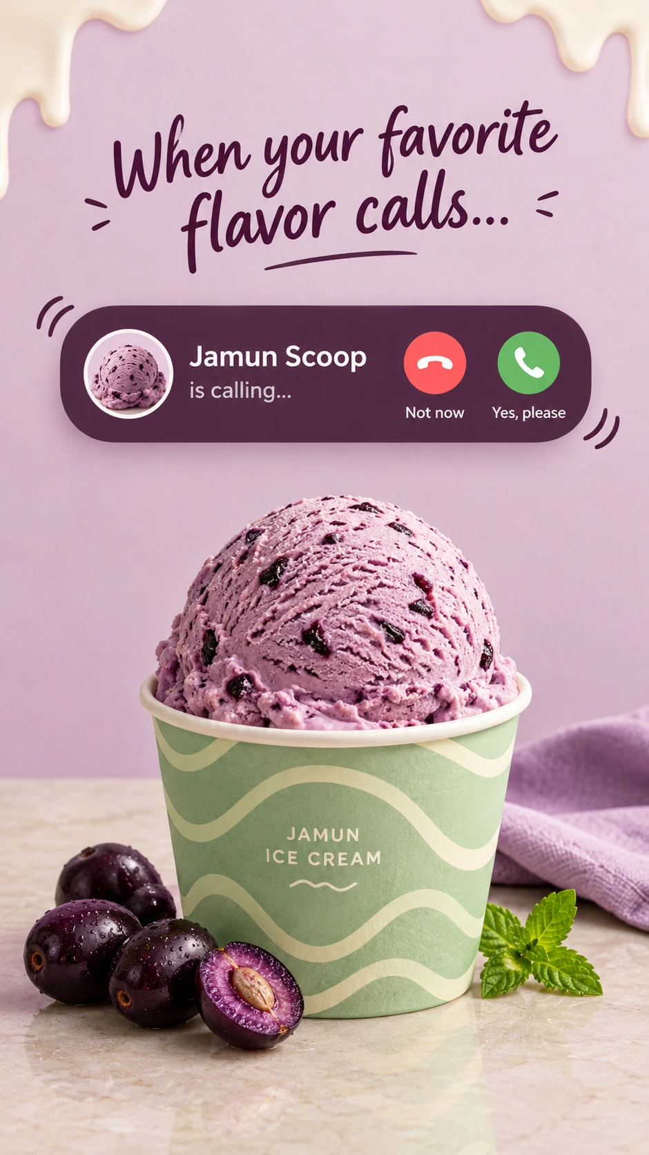
Create a playful ice-cream advertisement using an incoming-call metaphor: the featured flavor is “calling,” and the viewer is tempted to answer.
Combine a photorealistic ice-cream cup with a large simplified call notification, handwritten headline, and a soft flavor-inspired background.
OPTIONAL SETTINGS
• Product or flavor: [Use attached product or supplied details]
• Default flavor: [Jamun ice cream]
• Palette: [Soft lilac, deep mulberry, warm ivory, muted mint]
• Aspect ratio: [9:16 portrait]
AUTOMATIC PRODUCT RULES
Use a supplied product photograph or flavor description when available. Preserve actual packaging proportions and colors while removing visible brand names and logos.
If neither is supplied, create an unbranded cup of jamun ice cream. Stay within the frozen-dessert category and proceed without clarification.
Adapt the scoop color, fruit props, caller name, and thumbnail to the selected flavor. Do not add fruits or ingredients unrelated to the product.
DEFAULT COPY
Headline:
“When your favorite
flavor calls…”
Caller name:
“Jamun Scoop”
Call status:
“is calling…”
Button labels:
“Not now”
“Yes, please”
If the flavor changes, update the caller name accordingly.
COMPOSITION
Use a pale lilac backdrop and a light stone tabletop. Place a large ice-cream cup in the lower half, with one generous scoop rising above its rim.
Keep the headline centered in the upper quarter. Position the incoming-call panel below the headline and above the scoop, with clear breathing room around both.
The cup should occupy approximately 60% of the canvas width. Show its base and a soft reflection on the tabletop.
CALL INTERFACE
Create a wide dark-mulberry rounded rectangle with a subtle soft shadow.
On the left, include a circular thumbnail showing the same ice-cream flavor. Beside it, place the caller name in large ivory sans-serif and the smaller status line beneath.
On the right, show two circular controls: a muted coral decline button and a fresh green accept button. Use simple white phone-handset symbols and the supplied labels beneath.
Keep icon proportions clean and interface spacing consistent. Add two small curved vibration marks outside opposite corners of the panel.
This is a stylized advertising interface, not a full phone screen. Do not add phone brands, status bars, contact details, or unrelated controls.
ICE-CREAM DETAIL
Render a pale lavender jamun scoop with natural scoop ridges, dark fruit flecks, tiny frozen pores, and slight softening at the base.
Use an unbranded muted-mint paper cup with a restrained ivory wave pattern. Include only the small generic descriptor “JAMUN ICE CREAM.”
Place a few realistic dark-purple jamun fruits near the base, including one cut fruit showing plausible flesh and seed structure. Add a softly folded lavender napkin behind the cup and a small mint sprig at one edge.
Use restrained creamy drip shapes along the top border as graphic decoration. Keep them separate from the ice cream and interface.
LIGHTING AND FINISH
Use soft studio light from the upper left, with natural shadows and delicate highlights on the fruit. Keep the scoop and cup sharply detailed.
The mood should be cheerful, creamy, and appetizing. Preserve the reference’s incoming-call joke, flavor-matched colors, central cup, and simple interface.
Change the wording, panel proportions, cup artwork, and prop placement subtly. No logos, copied mascots, invented health claims, unreadable interface text, or watermarks.