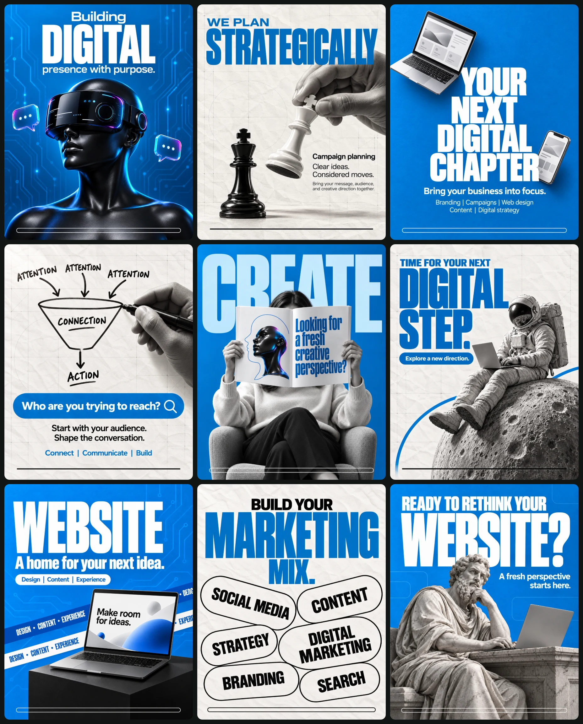
Campaign set · 9 images
Digital Marketing Agency Post Set
Instagram Post Sets
Way 2 · only some AI modelsThe whole set at onceOne master prompt that makes every design together.
Master prompt
Use this only if your AI model can make many images together in one go (multi-image generation). If it makes one image at a time, the result will not match. Use the separate prompts below instead.
Create a coordinated nine-image digital-agency campaign combining bold typography, grayscale cutout photography, tactile paper, and surreal technology metaphors.
OPTIONAL CAMPAIGN INPUTS
• Confirmed services: [Optional]
• Approved replacement copy: [Optional]
• Personal photograph for design 5: [Optional]
• Website screenshot for design 7: [Optional]
• Confirmed CTA for design 9: [Optional]
• Approved campaign image: [Optional]
• Artwork language: [English by default]
AUTOMATIC CONTENT RULES
Treat blank fields and unchanged placeholders as absent. Use the exact default copy in the numbered briefs unless approved replacements are supplied.
No brand names, logos, manufacturer emblems, suit patches, flags, websites, social handles, platform icons, QR codes, watermarks, designer signatures, or certification badges.
Do not invent prices, discounts, launch dates, contact details, availability, free consultations, performance guarantees, security claims, lead counts, revenue results, ratings, or awards. Service lists describe creative categories without promising outcomes.
IDENTITY AND REFERENCE HANDLING
Distinguish composition references from personal photographs and website screenshots.
For design 5, preserve a supplied person’s visible identity characteristics while keeping the face hidden behind the magazine. Without a personal photograph, use an original adult woman wearing an ivory sweatshirt and dark trousers.
For design 7, preserve the recognizable layout and visual structure of a supplied website screenshot while removing prohibited branding, contact details, and unverified claims. Without a screenshot, create an original editorial interface with abstract graphic shapes and the hero copy “Make room for ideas.” Avoid dense pseudo-text.
No recurring packaged product is required. Default props are original unbranded devices, chess pieces, a VR mannequin, an editorial magazine, an astronaut suit, and a classical marble philosopher sculpture.
GLOBAL PALETTE
• Electric blue #007BC4
• Deep blue #00598D
• Paper white #F5F4F0
• Near-black #151515
Cyan, violet, and magenta may appear only as restrained reflective accents in designs 1 and 5.
TYPOGRAPHY
Use a stable bold condensed sans-serif family for dominant headlines. Use a complementary geometric sans-serif for introductory lines, supporting copy, service lists, and labels.
Maintain tight headline leading, strong size contrast, readable spacing, and approximately 6% outer margins. Use white type on blue canvases and blue or black type on paper canvases.
GRAPHIC SYSTEM
Alternate electric-blue and warm-white paper backgrounds as specified below. Use subtle circuit traces only in designs 1 and 7. Use grayscale hero imagery except for restrained iridescent accents.
Replace the reference’s branded footer bars with a thin rounded horizontal rule near the bottom: white on blue backgrounds, black on paper backgrounds. The rule contains no text or icons.
No recurring CTA button. Design-specific search fields and capsules remain exactly as described.
LIGHTING AND FINISH
Use soft upper-left directional lighting, coherent contact shadows, natural material texture, crisp hero objects, and restrained background depth. Maintain realistic anatomy, credible hand grips, coherent device geometry, and legible typography.
For surreal scenes, preserve the conceptual impossibility while keeping materials, support, shadows, and perspective convincing.
CONSISTENCY WORKFLOW
Generate design 1 first. Use its approved blue, headline font character, margins, and finish as visual references for later blue posters.
Use design 2 to establish the paper texture and grayscale treatment for designs 4, 6, and 8. Keep headline families, footer-rule thickness, light direction, and blue values stable across all nine images.
Do not flatten all compositions into the same layout. Preserve each numbered concept and its distinct hierarchy.
NUMBERED DESIGN BRIEFS
1. BUILDING A DIGITAL PRESENCE
Use an electric-blue background with subtle circuit traces. Center a glossy black head-and-shoulders mannequin in the lower two-thirds, turned slightly toward viewer left and cropped at the chest.
Give it an oversized opaque black VR visor with restrained cyan, violet, and magenta edge reflections. Use abstract white interface marks on the visor rather than recognizable platform symbols. Float two small 3D chat bubbles beside the head.
Center this copy in the upper third:
“Building”
“DIGITAL”
“presence with purpose.”
Make “DIGITAL” exceptionally large, bold, condensed, and white. Use smaller white sans-serif for the other lines. Add the white bottom rule.
Use controlled studio lighting, a soft cyan rim, coherent reflective materials, and a darker blue gradient behind the shoulders.
2. STRATEGY AS A CHESS MOVE
Use warm-white crumpled paper with a faint architectural grid. A large grayscale hand enters from upper right and naturally grips the crown of a white chess king, suspending it near center-right. Place a black chess king upright below and left.
Upper-left copy:
“WE PLAN”
“STRATEGICALLY”
Use small blue sans-serif for the introduction and a very large blue condensed headline. Allow slight hand overlap while preserving readability.
At middle-right:
“Campaign planning”
“Clear ideas.
Considered moves.”
Below in small black text:
“Bring your message, audience,
and creative direction together.”
Use polished chess materials, realistic fingers, soft upper-left light, paper shadows, and the black bottom rule.
3. CONNECTED BUSINESS TOOLS
Use an electric-blue background with subtle paper grain. Center a large four-line white geometric sans-serif headline:
“YOUR
NEXT
DIGITAL
CHAPTER”
Float a small open silver laptop diagonally near the headline’s upper left, keyboard visible. Place a smaller smartphone near its lower right. Use simple original interface blocks without brands or readable claims.
Below:
“Bring your business into focus.”
Then:
“Branding | Campaigns | Web design”
“Content | Digital strategy”
Use smaller white sans-serif supporting copy, balanced negative space, realistic device geometry, restrained shadows, and the white bottom rule.
4. TURNING ATTENTION INTO CONNECTION
Use warm-white crumpled paper. Center a hand-drawn black funnel diagram in the upper half. Three arrows labeled “ATTENTION” enter a funnel labeled “CONNECTION.” One arrow exits toward “ACTION.”
Place a grayscale hand at right holding a black marker, its tip touching the funnel’s right outline. Make the diagram appear drawn on a transparent foreground pane.
Across the lower-middle area, place a broad blue rounded search field with a white magnifying-glass symbol at its right end.
Inside:
“Who are you trying to reach?”
Below:
“Start with your audience.
Shape the conversation.”
Near the lower quarter:
“Connect | Communicate | Build”
Use handwritten diagram labels and clean sans-serif elsewhere. No dollar symbol or financial-result claim. Add the black bottom rule.
5. THE AGENCY SEARCH, PRINTED
Use an electric-blue studio background. Seat an adult woman frontally in an ivory sweatshirt and dark trousers, one leg crossed comfortably. She holds an oversized open white magazine at head height, hiding her face. Both hands grip the outer page edges naturally.
Behind her, place enormous pale-blue uppercase “CREATE,” cropped at the side edges and partially hidden by her body.
The left magazine page contains a thin blue stylized head drawing and an abstract glossy black bust with a restrained cyan-violet-magenta light accent.
Physically print on the right page:
“Looking for
a fresh
creative
perspective?”
Use tall condensed blue type. Follow the page curvature and perspective. Do not float the text over the photograph.
Use realistic page thickness, paper folds, fingers, clothing, and chair support. Shoot at seated chest height with a 50mm perspective. Add the white bottom rule.
6. A DIGITAL LEAP
Use warm-white crumpled paper. Place a large grayscale cratered moonlike sphere emerging from lower right.
Seat an unbranded grayscale astronaut on its upper-left slope, facing viewer left. Extend the boots toward lower left. Rest an open laptop across the thighs, with gloved hands naturally on the keyboard.
Add one blue curved line sweeping behind the sphere, visible at lower left and toward the right.
At upper left:
“TIME FOR YOUR NEXT”
“DIGITAL”
“STEP.”
Use small blue sans-serif for the introduction and oversized blue condensed type for “DIGITAL” and “STEP.”
Below, in a small blue rounded capsule with white text:
“Explore a new direction.”
Use realistic suit joints, stable body support, detailed crater texture, soft upper-left light, and the black bottom rule. No star field or additional planets.
7. WEBSITE ON DISPLAY
Use an electric-blue background with faint circuit traces. Set an open dark laptop on a black rectangular display plinth in the lower-right area. Show it in three-quarter view with a nearly frontal, readable screen.
Use the supplied website screenshot according to the global rules. Otherwise show an original editorial interface with abstract shapes and:
“Make room for ideas.”
Run two diagonal ribbons behind the laptop and plinth: one deep blue with white lettering, the other white with blue lettering. Repeat only:
“DESIGN • CONTENT • EXPERIENCE”
At upper left:
“WEBSITE”
“A home for your next idea.”
Use enormous white condensed type for “WEBSITE” and a smaller bold supporting line.
Below, in a small white rounded capsule:
“Design | Content | Experience”
Keep ribbons away from the main headline and screen. Use coherent laptop geometry, matte plinth texture, soft upper-left light, and the white bottom rule. No unconfirmed speed, security, or performance claims.
8. THE MARKETING MIX
Use warm-white crumpled paper. Reserve the upper third for centered copy:
“BUILD YOUR”
“MARKETING”
“MIX.”
Use small black sans-serif for “BUILD YOUR,” very large blue condensed type for “MARKETING,” and smaller matching blue “MIX.”
Fill the lower two-thirds with large paper-colored capsules outlined in thin black strokes. Vary their angles and sizes, closely arranged with minimal overlap. Crop selected capsules at the canvas edges without making their labels unreadable.
Each label appears once:
“SOCIAL MEDIA”
“CONTENT”
“DIGITAL MARKETING”
“STRATEGY”
“BRANDING”
“SEARCH”
Use black uppercase geometric sans-serif aligned to each capsule. Set “DIGITAL MARKETING” on two lines if needed.
Keep outlines consistent and typography crisp. Add the black bottom rule, separated from labels. No photography or 3D effects.
9. A CLASSICAL WEBSITE RETHINK
Use an electric-blue background with subtle paper grain and extremely faint rounded interface outlines.
Place a grayscale marble philosopher sculpture in the lower two-thirds, facing viewer right. Use an adult bearded figure with carved draped robes, seated beside a stone desk. One hand rests near the chin; the other rests naturally near the keyboard of an open unbranded laptop on the desk.
Across the upper area:
“READY TO RETHINK YOUR”
“WEBSITE?”
Use a smaller white uppercase introduction and exceptionally large white condensed “WEBSITE?”
Below the headline, aligned right:
“A fresh perspective starts here.”
Use detailed marble curls, veining, robes, coherent fingers, stable laptop support, and soft upper-left light. Photograph from a slightly low frontal three-quarter angle with a 55mm perspective. Add the white bottom rule.
Do not add a free-consultation offer or additional CTA unless explicitly supplied.
FINAL OUTPUT REQUIREMENTS
Generate 9 separate finished images, one per numbered brief. Each image must have its own complete canvas. Do not combine them into a collage, grid, contact sheet, or multi-panel image.
All nine images use 4:5 portrait canvases.
If generation requires individual calls, generate them sequentially using the same approved campaign references.
Preserve the exact design-specific copy, objects, backgrounds, and compositions. Exclude contact-sheet gutters, presentation framing, reference branding, social icons, websites, and unsupported claims. Check typography, anatomy, perspective, physical support, and material consistency before completing each image.
All 9 images in this set
Each image has its own prompt. Tap an image to see it bigger.
Create a digital-agency campaign poster featuring a futuristic black mannequin wearing an oversized virtual-reality visor. Output one complete 4:5 portrait image.
OPTIONAL INPUTS
• Confirmed service details: [Optional]
• Custom headline: [Optional]
• Approved campaign image: [Optional]
AUTOMATIC RULES
Treat blank fields and unchanged placeholders as absent. Use the exact default copy below unless replacement copy is supplied. No brand names, logos, websites, social handles, platform icons, QR codes, invented statistics, or unsupported service claims.
CORE CONCEPT
Represent a digital presence through an anonymous futuristic figure immersed in technology.
COMPOSITION
Use an electric-blue background with subtle tone-on-tone circuit traces. Center a glossy black head-and-shoulders mannequin in the lower two-thirds, cropped at the chest. Turn its head slightly toward viewer left. Give it a broad opaque black VR visor with restrained cyan, violet, and magenta reflections along the edges.
Place two small floating three-dimensional chat bubbles beside the head, one on each side. Use abstract white interface marks on the visor rather than recognizable platform symbols. Keep the upper third clear for typography.
TYPOGRAPHY AND EXACT COPY
Center the following near the top:
“Building”
“DIGITAL”
“presence with purpose.”
Use a clean medium-weight sans-serif for the small first and third lines. Make “DIGITAL” exceptionally large, uppercase, bold, and condensed. Set all copy in warm white.
CAMPAIGN SYSTEM
Electric blue #007BC4, deep blue #00598D, paper white #F5F4F0, near-black #151515. Use cyan and violet only as restrained reflections. Maintain approximately 6% outer margins. Add a thin white rounded horizontal rule near the bottom, without icons or text. No CTA button.
LIGHTING AND FINISH
Use controlled studio lighting, a soft cyan rim, glossy visor reflections, and a darker blue gradient behind the shoulders. Render coherent head geometry and realistic reflective materials. Keep the figure sharp and the circuitry subtle.
OUTPUT
One standalone finished 4:5 poster. No grid, mockup frame, watermark, dense interface text, or extra copy.
Strategic chess campaign
Create a digital-agency campaign poster using a grayscale hand moving a white chess king above a black chess king. Output one complete 4:5 portrait image.
OPTIONAL INPUTS
• Confirmed service details: [Optional]
• Custom copy: [Optional]
• Approved campaign image: [Optional]
AUTOMATIC RULES
Blank inputs are absent. Use the default copy below unless replacements are supplied. Do not add brands, logos, websites, platform icons, prices, performance promises, or invented results.
CORE CONCEPT
Use a deliberate chess move as a metaphor for thoughtful campaign planning.
COMPOSITION
Use warm-white crumpled paper with a faint architectural grid. A large grayscale hand enters from the upper-right edge, naturally gripping the crown of a white chess king between thumb and fingers. Suspend the piece slightly above the paper surface near center-right. Place a black chess king upright below and left of it.
Keep both pieces recognizable, with coherent scale and soft cast shadows. The white piece must remain visibly supported by the hand.
TYPOGRAPHY AND EXACT COPY
Upper-left introduction:
“WE PLAN”
Below it, a large electric-blue condensed headline:
“STRATEGICALLY”
Let the hand overlap a small portion of the headline while keeping the word readable.
At middle-right:
“Campaign planning”
“Clear ideas.
Considered moves.”
Below, in small black sans-serif:
“Bring your message, audience,
and creative direction together.”
Use bold condensed sans-serif for the main headline, medium-weight sans-serif for the service heading, and regular sans-serif for supporting text.
CAMPAIGN SYSTEM
Electric blue #007BC4, deep blue #00598D, paper white #F5F4F0, near-black #151515. Use grayscale photography, 6% outer margins, and a thin black rounded horizontal rule near the bottom. No CTA button or footer information.
LIGHTING AND FINISH
Use soft directional light from upper left, detailed skin texture, polished chess surfaces, and subtle paper shadows. Preserve natural fingers and a convincing grip. Keep paper wrinkles visible but restrained.
OUTPUT
One standalone 4:5 poster. No collage grid, branding, extra chess pieces, invented metrics, or unsupported claims.
Your Next Digital Chapter Poster
Create a minimal digital-agency campaign poster built around oversized stacked typography with a floating laptop and smartphone. Output one complete 4:5 portrait image.
OPTIONAL INPUTS
• Confirmed service list: [Optional]
• Custom headline: [Optional]
• Approved campaign image: [Optional]
AUTOMATIC RULES
Use supplied service details when available. Otherwise use the default creative service categories below. Treat placeholders as absent. Do not invent measurable results, availability, prices, or guarantees. Remove all device branding, websites, social icons, and platform marks.
CORE CONCEPT
Show a connected digital presence through a bold typographic statement supported by everyday digital devices.
COMPOSITION
Use a clean electric-blue background with subtle paper grain. Center a large four-line headline through the upper and middle canvas. Float a small open silver laptop at upper left of the headline, rotated diagonally with its keyboard visible. Place a smaller smartphone beside the lower-right portion of the headline.
Give the devices coherent perspective, realistic thickness, and restrained shadows. Their screens show simple original interface blocks with no readable claims or recognizable software branding.
TYPOGRAPHY AND EXACT COPY
Main headline:
“YOUR
NEXT
DIGITAL
CHAPTER”
Use large warm-white bold geometric sans-serif type with tight leading and centered alignment.
Below:
“Bring your business into focus.”
Then a smaller two-line service list:
“Branding | Campaigns | Web design”
“Content | Digital strategy”
Use regular sans-serif with generous spacing. Keep service text readable.
CAMPAIGN SYSTEM
Electric blue #007BC4, deep blue #00598D, paper white #F5F4F0, near-black #151515. Maintain 6% outer margins. Add a thin white rounded horizontal rule near the bottom, without text or icons. No CTA button.
LIGHTING AND FINISH
Use softly lit metallic devices, clear screen geometry, and subtle ambient shading. Preserve strong negative space and crisp typography.
OUTPUT
One separate finished 4:5 poster. No brand logo, footer information, unsupported claims, extra devices, or presentation framing.
From attention to action
Create a digital-agency campaign poster featuring a grayscale hand drawing a customer-journey funnel on a transparent surface. Output one complete 4:5 portrait image.
OPTIONAL INPUTS
• Confirmed service details: [Optional]
• Custom search-bar copy: [Optional]
• Approved campaign image: [Optional]
AUTOMATIC RULES
Use default copy when fields are blank. No brands, websites, social icons, fabricated lead counts, revenue claims, guarantees, prices, or unsupported promises.
CORE CONCEPT
Make audience development visible through a hand-drawn funnel, presented as an exploration rather than a guaranteed financial result.
COMPOSITION
Use warm-white lightly crumpled paper. Center a black marker drawing in the upper half: three arrows labeled “ATTENTION” point into a simple funnel labeled “CONNECTION.” A single arrow exits below toward the word “ACTION.”
Place a grayscale hand holding a black marker on the right side of the diagram. The marker tip touches the funnel’s right outline as if completing the drawing. Use natural fingers and a credible writing grip. Make the diagram look drawn on a clear foreground pane while the paper remains behind it.
Across the lower-middle canvas, place a wide electric-blue rounded search field. Add a simple white magnifying-glass symbol at its right end.
TYPOGRAPHY AND EXACT COPY
Inside the blue field:
“Who are you trying to reach?”
Below it, centered in small black sans-serif:
“Start with your audience.
Shape the conversation.”
Near the lower quarter, in bold blue:
“Connect | Communicate | Build”
Use handwritten lettering only within the funnel diagram. Use clean sans-serif everywhere else.
CAMPAIGN SYSTEM
Electric blue #007BC4, deep blue #00598D, paper white #F5F4F0, near-black #151515. Use 6% margins and a thin black rounded horizontal rule near the bottom. The search field is a conceptual graphic, not a real platform interface. No additional CTA.
LIGHTING AND FINISH
Soft upper-left light, realistic grayscale skin, clear black marker strokes, subtle paper wrinkles, and restrained depth.
OUTPUT
One standalone 4:5 poster. No dollar symbol, invented results, brand marks, extra diagram labels, malformed hand, or grid presentation.
Create a fresh perspective
Create a digital-agency campaign poster showing a seated adult holding an oversized open magazine that hides their face. Output one complete 4:5 portrait image.
OPTIONAL INPUTS
• Personal photograph: [Optional]
• Custom magazine copy: [Optional]
• Approved campaign image: [Optional]
AUTOMATIC IDENTITY RULES
If a personal photograph is supplied, preserve the person’s visible skin tone, age, hair, and defining characteristics where visible. The face remains naturally hidden behind the magazine. Otherwise create an original adult woman. Use an ivory sweatshirt, dark trousers, and a simple chair. Do not add a name.
No brand names, logos, websites, social icons, factual claims, or invented contact details.
CORE CONCEPT
Turn the search for creative support into a physical editorial object held by the potential client.
COMPOSITION
Use an electric-blue studio background. Seat the adult frontally with one leg crossed comfortably over the other. The lower body fills the bottom third. The person holds a very large open white magazine at head height, completely covering the face. Show both hands naturally gripping the outer page edges.
The left page contains a thin electric-blue line drawing of a stylized head and an abstract glossy black bust with a small cyan-violet-magenta light accent. The right page carries the primary message.
Behind the person, place enormous pale-blue uppercase lettering reading “CREATE,” cropped by both side edges and partly concealed by the body.
TYPOGRAPHY AND EXACT COPY
Physically print this text on the right magazine page:
“Looking for
a fresh
creative
perspective?”
Use tall condensed electric-blue sans-serif, centered in four lines. Warp the lettering subtly with the paper’s curvature and perspective. Do not make it a floating overlay.
CAMPAIGN SYSTEM
Electric blue #007BC4, deep blue #00598D, paper white #F5F4F0, near-black #151515. Maintain 6% margins where applicable. Add a thin white rounded horizontal rule near the bottom. No CTA button.
LIGHTING AND FINISH
Use soft upper-left studio light, realistic fingers, paper folds, page thickness, fabric texture, and chair support. Shoot at seated chest height with a natural 50mm perspective. Keep the printed message sharp.
OUTPUT
One separate finished 4:5 poster. No visible replacement face, extra fingers, impossible page folds, logos, footer details, or contact-sheet framing.
Astronaut’s Next Digital Step
Create a surreal digital-agency campaign poster showing an astronaut using a laptop while seated on a moonlike sphere. Output one complete 4:5 portrait image.
OPTIONAL INPUTS
• Custom headline or confirmed service details: [Optional]
• Approved campaign image: [Optional]
AUTOMATIC RULES
Treat blank inputs as absent and use the exact default copy below. Remove suit patches, flags, agency insignia, device logos, websites, social icons, and certification marks. Do not invent service guarantees or factual performance claims.
CORE CONCEPT
Use an astronaut working from an unexpected place as a metaphor for taking a new digital step.
COMPOSITION
Use a warm-white crumpled-paper background. Place a large grayscale cratered moonlike sphere emerging from the lower-right corner, naturally cropped by the bottom and right edges.
Seat a grayscale astronaut on its upper-left slope, facing viewer left in three-quarter profile. Extend the boots diagonally toward lower left. Rest an open unbranded laptop across the astronaut’s thighs, with gloved hands positioned naturally on the keyboard. Preserve credible body support, suit joints, and device balance.
Add one electric-blue curved line sweeping behind the sphere, visible near the lower-left edge and again toward the right. Keep the upper-left area clear for type.
TYPOGRAPHY AND EXACT COPY
At upper left:
“TIME FOR YOUR NEXT”
“DIGITAL”
“STEP.”
Use medium-weight blue sans-serif for the introductory line and very large blue condensed uppercase type for “DIGITAL” and “STEP.”
Below, inside a small blue rounded capsule:
“Explore a new direction.”
Set capsule lettering in white. This is a graphic supporting line, not an additional button.
CAMPAIGN SYSTEM
Electric blue #007BC4, deep blue #00598D, paper white #F5F4F0, near-black #151515. Use grayscale cutout imagery, 6% margins, and a thin black rounded horizontal rule near the bottom.
LIGHTING AND FINISH
Use soft upper-left light with detailed suit fabric, crater texture, grounded shadows, and a dark reflective visor. Keep the surreal premise but make all physical relationships coherent.
OUTPUT
One standalone 4:5 poster. No star field, extra planets, branding, invented claims, distorted anatomy, or presentation grid.
Blue website ideas on display
Create a digital-agency campaign poster presenting an open laptop on a black display plinth, surrounded by diagonal typographic ribbons. Output one complete 4:5 portrait image.
OPTIONAL INPUTS
• Website screenshot: [Optional]
• Confirmed website service details: [Optional]
• Approved campaign image: [Optional]
AUTOMATIC CONTENT RULES
If a website screenshot is supplied, retain its recognizable layout and visual structure while removing brand names, logos, websites, contact details, and unverified claims. Otherwise create an original editorial website interface with simple abstract shapes and the readable hero copy “Make room for ideas.” Avoid dense pseudo-text.
Do not claim speed, security, accessibility, responsiveness, or performance unless confirmed. Blank fields are absent.
CORE CONCEPT
Treat a website as a designed product worthy of a studio showcase.
COMPOSITION
Use an electric-blue background with faint circuit traces. Place a black rectangular display plinth across the lower-right area. Set an open dark laptop on top, facing the camera in three-quarter view. Keep its screen nearly frontal and clearly readable.
Run two broad diagonal ribbons behind the laptop and plinth. One is deep blue with white text; the other is white with blue text. Repeat only “DESIGN • CONTENT • EXPERIENCE” along them. Let the ribbons extend beyond the canvas edges without covering the main headline or screen.
TYPOGRAPHY AND EXACT COPY
At upper left:
“WEBSITE”
“A home for your next idea.”
Use enormous condensed white uppercase letters for “WEBSITE,” with a smaller bold sans-serif supporting line.
Below, in a small white rounded capsule:
“Design | Content | Experience”
CAMPAIGN SYSTEM
Electric blue #007BC4, deep blue #00598D, paper white #F5F4F0, near-black #151515. Maintain 6% outer margins. Add a thin white rounded horizontal rule near the bottom. No additional CTA, logo, website address, or social icons.
LIGHTING AND FINISH
Use soft upper-left studio light, realistic laptop hinges and keyboard, controlled screen reflections, matte plinth texture, and convincing contact shadows. Use a natural 50mm perspective and keep the screen sharp.
OUTPUT
One separate finished 4:5 poster. Avoid floating hardware, warped screens, invented performance claims, brands, extra ribbons, and mockup borders.
Build Your Marketing Mix Poster
Create a typography-led digital-agency campaign poster using oversized outlined capsule shapes containing marketing disciplines. Output one complete 4:5 portrait image.
OPTIONAL INPUTS
• Confirmed service categories: [Optional]
• Custom headline: [Optional]
• Approved campaign image: [Optional]
AUTOMATIC RULES
Use supplied service categories when provided; otherwise use the exact default labels below as creative themes. Treat blank placeholders as absent. Do not add brands, logos, websites, social icons, statistics, guarantees, or invented business results.
CORE CONCEPT
Present marketing as a connected mix of disciplines through a dynamic field of typographic capsules.
COMPOSITION
Use warm-white crumpled paper with subtle folds. Reserve the upper third for the headline. Fill the lower two-thirds with large white or paper-colored capsules outlined in thin near-black strokes.
Vary their angles and sizes. Let several extend beyond the left, right, and bottom edges, suggesting a larger connected field. Arrange them closely with minimal overlap so every label remains readable. Use black uppercase geometric sans-serif inside the capsules, aligned with each capsule’s rotation.
TYPOGRAPHY AND EXACT COPY
Top, centered:
“BUILD YOUR”
“MARKETING”
“MIX.”
Use small black sans-serif for “BUILD YOUR,” very large electric-blue condensed uppercase for “MARKETING,” and a smaller matching blue “MIX.”
Capsule labels, each appearing once:
“SOCIAL MEDIA”
“CONTENT”
“DIGITAL MARKETING”
“STRATEGY”
“BRANDING”
“SEARCH”
Keep “DIGITAL MARKETING” on two lines if needed. Do not add random filler words.
CAMPAIGN SYSTEM
Electric blue #007BC4, deep blue #00598D, paper white #F5F4F0, near-black #151515. Keep the headline within 6% outer margins. Add a thin black rounded horizontal rule near the bottom, visually separated from the capsule labels. No CTA.
FINISH
Use crisp editorial typography over tactile paper. Preserve smooth capsule outlines, consistent stroke weights, intentional spacing, and strong hierarchy. No photography or unnecessary 3D effects.
OUTPUT
One standalone finished 4:5 poster. No brand marks, extra copy, unreadable labels, grid framing, or unsupported claims.
Marble philosopher rethinks your website
Create a surreal digital-agency campaign poster showing a classical marble philosopher sculpture using a modern laptop. Output one complete 4:5 portrait image.
OPTIONAL INPUTS
• Custom headline: [Optional]
• Confirmed CTA: [Optional]
• Approved campaign image: [Optional]
AUTOMATIC RULES
Use the default copy below unless replacements are supplied. Treat blank fields as absent. Do not invent a free consultation, offer, booking availability, price, deadline, or guarantee. Remove device branding, logos, websites, social icons, and signatures.
CORE CONCEPT
Bring classical contemplation into a contemporary digital task: a thoughtful figure reconsidering a website.
COMPOSITION
Use an electric-blue background with subtle paper grain and a few extremely faint rounded interface outlines.
Place a grayscale marble sculpture of an adult bearded philosopher in the lower two-thirds, turned toward viewer right. The figure wears carved draped robes and sits beside a simple stone desk. One hand rests thoughtfully near the chin; the other rests naturally near the keyboard of an open unbranded laptop on the desk.
Keep the head below the main headline. Show believable carved anatomy, separated fingers, marble veining, robe folds, and stable desk support. Do not reproduce a specific branded mascot or contemporary character.
TYPOGRAPHY AND EXACT COPY
Across the upper area:
“READY TO RETHINK YOUR”
“WEBSITE?”
Use a smaller white uppercase sans-serif introduction and an exceptionally large white condensed “WEBSITE?” below it.
Under the main headline, aligned right:
“A fresh perspective starts here.”
Use small white sans-serif. No additional CTA unless confirmed.
CAMPAIGN SYSTEM
Electric blue #007BC4, deep blue #00598D, paper white #F5F4F0, near-black #151515. Maintain 6% margins. Add a thin white rounded horizontal rule near the bottom, without icons or text.
LIGHTING AND FINISH
Use soft upper-left studio light, dimensional grayscale marble, detailed curls and robe folds, restrained laptop reflections, and coherent contact shadows. Photograph from a slightly low frontal three-quarter angle with a natural 55mm perspective.
OUTPUT
One separate finished 4:5 poster. Avoid fused fingers, floating laptop parts, illegible keyboard geometry, invented offers, brand marks, and contact-sheet framing.