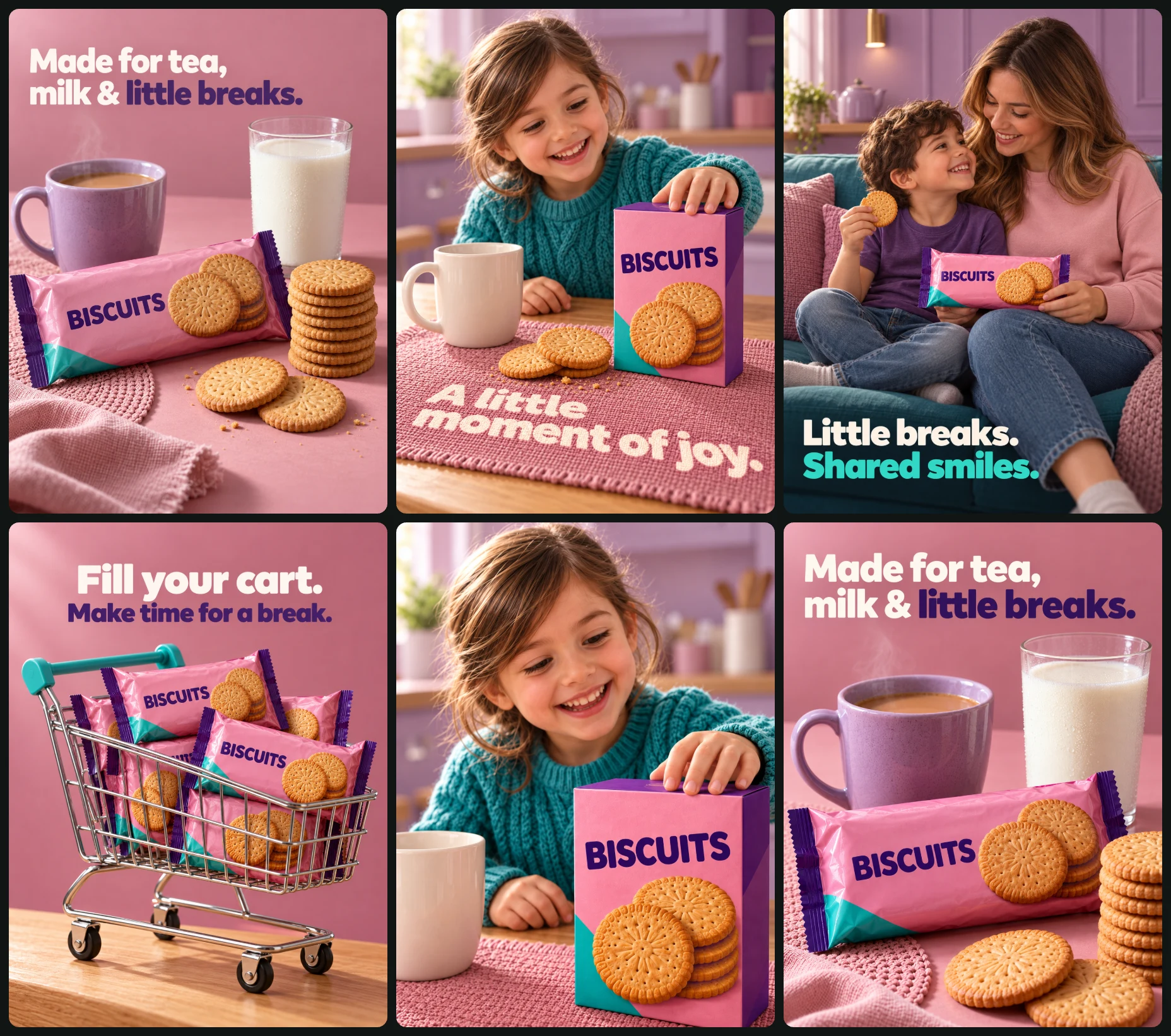
Campaign set · 6 images
Biscuit Brand Instagram Post Set
Instagram Post Sets
Way 2 · only some AI modelsThe whole set at onceOne master prompt that makes every design together.
Master prompt
Use this only if your AI model can make many images together in one go (multi-image generation). If it makes one image at a time, the result will not match. Use the separate prompts below instead.
Create a coherent six-image photorealistic biscuit advertising campaign. Combine welcoming tea-break still lifes, joyful family moments, and a playful shopping-cart composition. Each design uses a complete 3:4 portrait canvas.
OPTIONAL CAMPAIGN INPUTS
• Product photograph or photographs: [Attach if available]
• Product details: [Optional]
• Personal identity photographs: [Optional; identify the intended role]
• Approved campaign image: [Optional]
• Artwork language: [English by default]
AUTOMATIC PRODUCT HANDLING
1. Prioritize separately supplied product photographs. Preserve silhouette, geometry, proportions, packaging format, materials, colors, closures, non-brand label layout, and visible biscuit appearance.
2. If no photograph is supplied, follow written details.
3. Otherwise use the explicitly defined fictional products below.
Remove brand names, logos, websites, social handles, QR codes, manufacturer marks, certification badges, and unsupported claims. Preserve package structure while removing branding. Do not invent ingredients, flavors, weights, prices, discounts, nutrition, awards, or benefits.
If only one real product is supplied, use that same packaging format throughout all six designs. Do not transform a flexible packet into a carton. Repeat the same product in the cart without inventing variants.
FICTIONAL PRODUCT DEFINITIONS
For designs 1, 3, 4, and 6: an original pink pillow-pack biscuit wrapper with deep-violet crimped ends, a small teal lower corner, a photograph of golden round embossed biscuits, and only the generic label “BISCUITS.”
For designs 2 and 5: an upright rectangular carton using the same fictional pink, violet, and teal visual system, the same biscuit imagery, and only “BISCUITS.”
These are two package formats of the same fictional biscuit. Use consistent golden round embossed biscuits in every fictional product depiction. Do not add flavor names or factual claims. Reuse the first approved depiction of each format for later images.
IDENTITY HANDLING
Preserve every supplied person’s recognizable facial features, skin tone, age, hairstyle, and defining characteristics. Use original people for missing roles; never duplicate an identity to fill another role.
The child in designs 2 and 5 must be the same person. Without a supplied identity, create an original child around six years old with side-swept brown hair, wearing a teal cable-knit sweater.
For design 3, without supplied identities, create an adult mother with long dark-blonde hair and a young son with short curly dark hair. The son must be distinct from the child in designs 2 and 5. Dress the mother in a blush sweatshirt and jeans, and the son in a violet T-shirt and jeans.
GLOBAL VISUAL SYSTEM
• Dusty pink: #DFA0B3
• Deep violet: #4B3475
• Lavender: #A79BC8
• Teal: #20BCAF
• Warm ivory: #FFF7ED
• Biscuit gold: #D99B43
Retain real supplied product colors even when they differ from the campaign palette.
Use heavy rounded geometric sans-serif typography with tight but readable spacing, strong two-line hierarchy, and restrained copy. Use warm ivory and deep violet for most headlines; design 3 uses warm ivory and teal.
Shared motifs are pink surfaces and woven mats, lavender environments or ceramics, teal accents, warm wood, and golden biscuit texture. Maintain variety in arrangement and camera crop.
Use soft upper-left light throughout, coherent rightward shadows, realistic skin, fabrics, wrapper folds, glass, chrome, and baked biscuit texture. Use natural 40–60mm photographic perspectives. Keep faces, hands, and hero products clear; soften backgrounds selectively.
CTA RULES
No CTA buttons, purchase links, offers, badges, footer bars, logos, or websites. Use only the exact promotional copy specified for each design. Appropriate non-brand product information may remain.
CONSISTENCY WORKFLOW
Generate design 1 first and use its approved palette, typography, lighting, and finish as the campaign reference. Continue using the original supplied product photograph for product identity in every image.
Approve the carton depiction and child identity in design 2, then reuse them in design 5. Reuse design 1’s vessels and still-life product depiction in design 6. Keep product dimensions, biscuit appearance, materials, light direction, and type character stable.
NUMBERED DESIGN BRIEFS
1. TEA, MILK & BISCUIT STILL LIFE
Use a seamless dusty-pink background and tabletop. Place a horizontal biscuit packet diagonally across the lower-left foreground, a lavender mug of tea behind it on the left, and a tall clear glass of milk behind it near upper center-right. Arrange approximately eight biscuits in a stable stack to the packet’s right and two loose biscuits in front.
Add blush fabric entering the lower-left corner and a small woven pink placemat. Include wheat stalks only for the fictional wheat-biscuit default or when appropriate to confirmed supplied product details.
Place this headline at upper left:
“Made for tea,
milk & little breaks.”
Use warm ivory for most words and deep violet for “little breaks.” No other promotional copy.
Use a 55mm perspective from slightly above tabletop height, soft upper-left studio light, restrained tea steam, subtle milk-glass condensation, realistic contact shadows, and crisp hero-product detail.
2. THE EAGER REACH
Place the recurring child behind a honey-colored wooden kitchen table, with the delighted face in the upper center. Extend one anatomically correct hand toward the top-front edge of the hero package in the lower center-right.
Use the fictional carton unless a supplied product requires another format. Place a plain ivory mug on the left and a dusty-pink woven mat beneath the objects. Use a softly blurred lavender kitchen background.
Physically print this exact line on the mat:
“A little moment of joy.”
Use bold warm-ivory rounded sans-serif lettering aligned to the fabric’s perspective and texture. It must not float as a graphic overlay. No other promotional copy.
Use natural 40–50mm perspective at approximately the child’s eye level, soft upper-left daylight, and clear focus on eyes, reaching hand, and package.
3. A SHARED SOFA BREAK
Seat the mother on the right of a teal sofa with her son close against her left side. Show them from head to approximately the feet. The mother wears a blush sweatshirt and jeans; the boy wears a violet T-shirt and jeans.
The child holds one biscuit near shoulder height. The mother supports a front-facing packet across their laps. Keep grips natural and all limbs connected correctly.
Use violet wall panels, a slim brass wall light at upper left, and a background ledge with a small lavender teapot. Reserve a darker lower-left area for this headline:
“Little breaks.
Shared smiles.”
Set the first line in warm ivory and the second in teal. Keep the headline clear of faces, hands, and packaging. No other promotional copy.
Use a 50mm perspective at seated chest height, soft upper-left window light, natural skin texture, and clear faces and package.
4. A CART FULL OF LITTLE BREAKS
Show a miniature chrome-wire shopping cart in three-quarter side view against a dusty-pink studio background. Place the chunky teal handle toward upper left and extend the basket rightward.
Fill it with approximately six copies of the same biscuit packet, varied in angle, with two front panels clearly visible. Keep every packet supported within the basket.
Rest the cart on a narrow honey-colored wooden surface sloping upward toward the right along the bottom. Match the cart’s orientation to the slope, with believable wheel contact, reflections, and weight distribution.
Center this headline in the upper quarter:
“Fill your cart.
Make time for a break.”
Set the first line in warm ivory and the second in deep violet. No other promotional copy.
Use a natural 60mm perspective from slightly below basket height and soft upper-left light. Keep cart geometry and hero packet faces clear.
5. THE EAGER REACH — CLOSE CROP
Reuse design 2’s child, sweater, package, kitchen, mug, mat, and lighting. Create a tighter composition with the child’s joyful face centered in the upper half and one hand reaching toward the package in the lower-right foreground.
Enlarge the package to occupy much of the lower third. Its bottom edge may extend beyond the canvas, but keep its main front panel recognizable. Partially crop the ivory mug near lower left if needed. Include a narrow strip of wooden tabletop and pink mat.
Keep breathing room above the hair and preserve the eyes, smile, and reaching fingers within the frame. Use a natural 50mm perspective at the child’s eye level.
No promotional headline, caption, CTA, name, footer, or decorative text. The mat has no lettering in this design. Retain only appropriate non-brand package information.
6. TEA & MILK — CLOSE CROP
Reuse design 1’s packet, biscuit appearance, lavender mug, milk glass, and surface styling. Create a tighter composition with the mug at middle left, milk glass behind at middle right, and an enlarged horizontal packet across the lower foreground.
Allow the packet’s bottom edge to extend beyond the canvas while keeping its front panel recognizable. Add a stable biscuit stack partially cropped near lower right and a narrow glimpse of blush fabric or woven pink mat at the bottom. Omit ingredient props.
Keep the upper quarter open for this exact headline:
“Made for tea,
milk & little breaks.”
Use warm ivory for most words and deep violet for “little breaks,” matching design 1’s typography. No other promotional copy.
Use a natural 55mm perspective from slightly above tabletop height, soft upper-left studio light, restrained tea steam, subtle glass condensation, and clear product texture.
FINAL OUTPUT REQUIREMENTS
Generate 6 separate finished images, one per numbered brief. Each image must have its own complete canvas. Do not combine them into a collage, grid, contact sheet, or multi-panel image.
If the image tool requires individual calls, generate the six designs sequentially using the same approved campaign references and original product photographs.
Do not include the reference sheet’s presentation edges, gutters, branding, website addresses, or accidentally truncated panel boundaries. Maintain realistic anatomy, natural grips, coherent packaging, supported objects, readable typography, and consistent lighting. Do not add unsupported factual claims.
All 6 images in this set
Each image has its own prompt. Tap an image to see it bigger.
Create a photorealistic biscuit advertisement featuring a hero biscuit packet arranged with tea, milk, and loose biscuits. Use a 3:4 portrait canvas.
OPTIONAL INPUTS
• Product photograph: [Attach if available]
• Product details: [Optional]
• Approved campaign image: [Optional]
• Artwork language: [English by default]
AUTOMATIC PRODUCT RULES
Use a separately supplied product photograph as the exact product identity: preserve packet geometry, proportions, material, colors, closures, non-brand label arrangement, and visible biscuit appearance. Remove brand names, logos, websites, certification symbols, and unsupported claims without redesigning the packaging. If no photograph is supplied, follow written details. If neither is supplied, create an original pink pillow-pack biscuit wrapper with deep-violet crimped ends, a small teal lower corner, a photograph of golden round embossed biscuits, and the minimal generic label “BISCUITS.” No invented flavor, ingredient, weight, or benefit claims.
CORE CONCEPT AND COMPOSITION
Present biscuits as a welcoming companion to an everyday tea break. Use a seamless dusty-pink background and tabletop. Place a large horizontal packet diagonally across the lower-left foreground, its front panel clearly visible. Behind it, place a lavender ceramic mug of tea on the left and a tall clear glass of milk near the upper center-right. Keep both vessels distinct and correctly scaled.
Arrange a stable vertical stack of approximately eight golden biscuits to the right of the packet, with two loose biscuits in front. Match all loose biscuits to the supplied product when their appearance is known; otherwise use the fictional round embossed biscuit consistently. Drape soft blush fabric into the lower-left corner and place a small woven pink placemat beneath the arrangement. Add wheat stalks only for the fictional wheat-biscuit default or when confirmed appropriate for the supplied product.
TYPOGRAPHY AND EXACT COPY
Set this headline at the upper left:
“Made for tea,
milk & little breaks.”
Use a heavy rounded geometric sans-serif with tight spacing. Use warm ivory for most words and deep violet for “little breaks.” Keep generous space between the headline and vessels. No footer, CTA, logo, badge, or website.
CAMPAIGN SYSTEM
Dusty pink #DFA0B3, deep violet #4B3475, lavender #A79BC8, teal #20BCAF, warm ivory #FFF7ED, and biscuit gold #D99B43. Retain supplied product colors if different. Use an approved campaign image for matching typography, lighting, and surface treatment while retaining the original product photograph for identity.
LIGHTING AND FINISH
Use soft upper-left studio light, gentle rightward shadows, realistic packet folds, biscuit crumbs and baked texture, subtle condensation on the milk glass, and restrained steam above the tea. Photograph from slightly above tabletop height with a natural 55mm perspective. Keep the packet and biscuits sharply resolved, with modest background softness.
OUTPUT
Generate one separate finished advertisement on its own complete 3:4 canvas. Do not include the reference grid, gutters, presentation framing, extra lettering, distorted packaging, or unsupported claims.
Joyful child reaches for biscuits
Create a photorealistic family biscuit advertisement showing a delighted young child reaching toward a large biscuit package on a kitchen table. Use a 3:4 portrait canvas.
OPTIONAL INPUTS
• Product photograph or details: [Optional]
• Child identity photograph: [Optional]
• Approved campaign image: [Optional]
• Artwork language: [English by default]
AUTOMATIC PRODUCT AND IDENTITY RULES
Prioritize a separate product photograph, preserving its format, geometry, material, colors, closures, non-brand label arrangement, and biscuit appearance. Remove branding, websites, certification marks, and unsupported claims. Otherwise use written details. The fictional default is an upright rectangular biscuit carton with a pink front, violet sides, a small teal lower corner, golden round embossed biscuit imagery, and only the generic label “BISCUITS.” If a supplied product is a flexible packet, retain that format and rest it naturally on the table rather than turning it into a carton.
If a child identity photograph is supplied, preserve facial features, skin tone, age, hairstyle, and defining characteristics. Otherwise create an original child around six years old, with side-swept brown hair and a teal cable-knit sweater. Do not copy the reference child’s exact identity.
CORE CONCEPT AND COMPOSITION
Capture a spontaneous moment of anticipation. Position the child behind a honey-colored wooden kitchen table, facing the camera with bright eyes and an open, delighted smile. The face occupies the upper central area. Extend one hand toward the top-front edge of the package, bringing the fingertips slightly closer to the camera. Keep five anatomically correct fingers, a natural wrist, and believable perspective.
Place the package prominently in the lower center-right with its front panel readable. Set a plain ivory ceramic mug to its left. Place both on a textured dusty-pink woven mat. Use a softly blurred lavender kitchen with cabinets, counter, and window light behind the child. Keep the product and hand from obscuring the face.
TYPOGRAPHY AND EXACT COPY
Print “A little moment of joy.” physically onto the front portion of the woven mat in bold warm-ivory rounded sans-serif. Align the lettering to the mat’s perspective, with realistic textile texture. It must appear printed on the fabric, not floating over the photograph. No additional headline, CTA, footer, logo, or website.
CAMPAIGN SYSTEM
Dusty pink #DFA0B3, deep violet #4B3475, lavender #A79BC8, teal #20BCAF, warm ivory #FFF7ED, and biscuit gold #D99B43. Use heavy rounded geometric sans-serif lettering. Preserve supplied package colors. Match any approved campaign image’s lighting and finish.
LIGHTING AND CAMERA
Use soft daylight from upper left, warm skin highlights, gentle contact shadows, and a natural 40–50mm perspective at approximately the child’s eye level. Focus on the eyes, reaching hand, and hero package; softly separate the kitchen background. Render natural skin and knit texture.
OUTPUT
Generate one separate finished 3:4 advertisement. Avoid exaggerated wide-angle hands, extra fingers, duplicated limbs, floating objects, dense pseudo-text, brand marks, and invented factual claims.
Shared smiles over biscuits
Create a photorealistic biscuit advertisement showing a mother and young son sharing a relaxed snack moment on a teal sofa. Use a 3:4 portrait canvas.
OPTIONAL INPUTS
• Product photograph or details: [Optional]
• Personal photographs for either or both people: [Optional]
• Approved campaign image: [Optional]
• Artwork language: [English by default]
AUTOMATIC PRODUCT AND IDENTITY RULES
Use the supplied product photograph first, preserving packaging shape, proportions, materials, colors, closures, non-brand label structure, and biscuit appearance. Remove brand names, logos, websites, badges, and unsupported claims. Otherwise follow written details. Default to an original pink pillow-pack biscuit wrapper with violet crimped ends, a small teal lower corner, golden round embossed biscuit imagery, and only “BISCUITS” as its generic label.
Preserve each supplied person’s recognizable identity, skin tone, age, hairstyle, and defining features. Use original people for missing roles without duplicating any identity. Without personal photographs, create an adult mother with long dark-blonde hair and a smiling young son with short curly dark hair. Keep their faces distinct from children used elsewhere in the campaign.
CORE CONCEPT AND COMPOSITION
Seat the mother on the right half of a teal upholstered sofa with her son close against her left side. Show them from head to approximately the feet. The mother wears a soft blush sweatshirt and blue jeans; the boy wears a violet T-shirt and blue jeans. Keep posture comfortable and affectionate.
The child holds one round biscuit near shoulder height in a relaxed, anatomically correct grip. The mother supports a front-facing biscuit packet across their laps. Match the loose biscuit to the supplied product where visible; use the golden round embossed default only for the fictional product.
Use a violet living room with simple vertical wall panels, a slim brass wall light at upper left, and a small background ledge with an understated lavender teapot. Keep the environment sparse. Reserve a darker, uncluttered lower-left region for the headline.
TYPOGRAPHY AND EXACT COPY
Place at lower left:
“Little breaks.
Shared smiles.”
Use a heavy rounded geometric sans-serif, large and left aligned. Set the first line in warm ivory and the second in teal, maintaining clear contrast with the darker background. Keep text away from faces, hands, and the packet. No CTA, footer, logo, or website.
CAMPAIGN SYSTEM
Dusty pink #DFA0B3, deep violet #4B3475, lavender #A79BC8, teal #20BCAF, warm ivory #FFF7ED, and biscuit gold #D99B43. Retain supplied product colors. Match the approved campaign image’s font character, light direction, and color treatment.
LIGHTING AND CAMERA
Use soft upper-left window light, natural skin texture, gentle shadows beneath the people, visible upholstery weave, and realistic fabric folds. Use a 50mm portrait perspective from seated chest height. Keep both faces and the packet clear, with subtle background softness.
OUTPUT
Generate one separate finished advertisement on its own complete 3:4 canvas. Avoid duplicated people, fused hands, awkward grips, mismatched biscuit shapes, packaging distortion, branding, and unsupported claims.
Teal cart of golden biscuits
Create a playful photorealistic biscuit advertisement featuring a miniature shopping cart filled with biscuit packets against a dusty-pink studio background. Use a 3:4 portrait canvas.
OPTIONAL INPUTS
• Product photograph or details: [Optional]
• Approved campaign image: [Optional]
• Artwork language: [English by default]
AUTOMATIC PRODUCT RULES
Use a separate product photograph as the exact packaging reference, preserving its geometry, proportions, material, colors, closures, and non-brand label layout. Remove branding, websites, certification marks, and unsupported claims. If details alone are supplied, follow them. Otherwise create an original pink pillow-pack wrapper with deep-violet crimped ends, a small teal lower corner, golden round embossed biscuit imagery, and the minimal generic label “BISCUITS.”
Repeat the same supplied or fictional product throughout the cart. Do not invent flavors, sizes, or unsupported variants.
CORE CONCEPT AND COMPOSITION
Turn an ordinary grocery item into an abundant, cheerful shopping moment. Use a small chrome-wire shopping cart with a chunky teal handle, shown in three-quarter side view. The handle sits toward the upper left, while the basket extends rightward.
Fill the basket with approximately six packets of the same product, arranged at varied angles with two front panels clearly visible. Keep packets physically contained by the wire basket; allow a few to rise above the rim without floating.
Place the cart on a narrow honey-colored wooden surface running diagonally upward toward the right across the bottom of the canvas. Match the cart’s orientation to the sloping surface. Show believable wheel contact, undercarriage, reflections, and weight distribution. Let the cart dominate the lower two-thirds, leaving clean headline space above.
TYPOGRAPHY AND EXACT COPY
Center the headline near the upper quarter:
“Fill your cart.
Make time for a break.”
Use heavy rounded geometric sans-serif lettering. Set the first line in warm ivory and the second in deep violet. Use balanced line spacing and clear separation from the packages. No CTA button, offer, price, logo, website, or footer.
CAMPAIGN SYSTEM
Dusty pink #DFA0B3, deep violet #4B3475, lavender #A79BC8, teal #20BCAF, warm ivory #FFF7ED, and biscuit gold #D99B43. Retain supplied packaging colors. Match an approved campaign image’s typography, light direction, and finish.
LIGHTING AND CAMERA
Use soft upper-left studio light, polished but realistic chrome reflections, crisp wire geometry, subtle wrapper sheen, and coherent shadows falling rightward. Photograph with a natural 60mm perspective from slightly below basket height. Keep the cart and hero packet faces clearly resolved.
OUTPUT
Generate one separate finished 3:4 advertisement. Avoid floating wheels, intersecting packets, bent wire geometry, duplicated text artifacts, invented product variants, brands, badges, and unsupported claims.
Smiling child reaches for biscuits
Create a close-cropped photorealistic family biscuit advertisement showing a delighted child reaching toward a biscuit package in the foreground. Use a complete 3:4 portrait canvas.
OPTIONAL INPUTS
• Product photograph or details: [Optional]
• Child identity photograph: [Optional]
• Approved child-reaching campaign image: [Optional]
• Artwork language: [English by default]
AUTOMATIC PRODUCT AND IDENTITY RULES
Preserve a separately supplied product’s packaging format, shape, proportions, material, colors, closures, non-brand label layout, and visible biscuit appearance. Remove brands, logos, websites, badges, and unsupported claims. Otherwise follow written details. The fictional default is a rectangular pink biscuit carton with violet sides, a small teal lower corner, golden round embossed biscuit imagery, and only the label “BISCUITS.” Retain a supplied flexible packet as a flexible packet.
Preserve the identity of a supplied child photograph. If an approved earlier child-reaching image is available, reuse that same child, teal cable-knit sweater, kitchen, mug, mat, and product depiction. Otherwise create an original child around six with side-swept brown hair and a teal cable-knit sweater.
CORE CONCEPT AND COMPOSITION
Create a tighter companion to a wider child-reaching advertisement. Center the child’s delighted face in the upper half. Show an open, joyful smile and bright eyes, with one hand extending toward the package in the lower-right foreground. Keep the hand natural, with five fingers and believable foreshortening.
Enlarge the product so that it occupies much of the lower third. Its lower edge may extend naturally beyond the canvas, but preserve the main front panel and recognizable geometry. Keep a plain ivory mug near the lower-left edge, partially cropped if necessary. Show a strip of wooden tabletop and a textured dusty-pink mat beneath the product.
Use a softly blurred lavender kitchen. Maintain breathing room above the child’s hair and do not crop the eyes, mouth, or reaching fingers.
TEXT
No promotional headline, caption, CTA, name, footer, or decorative lettering. Keep only appropriate non-brand product-label information, using “BISCUITS” for the fictional default. The mat has no lettering in this close-crop variation.
CAMPAIGN SYSTEM
Dusty pink #DFA0B3, deep violet #4B3475, lavender #A79BC8, teal #20BCAF, warm ivory #FFF7ED, and biscuit gold #D99B43. Retain supplied product colors. Match the approved wider child image’s materials and color grading.
LIGHTING AND CAMERA
Use soft upper-left daylight and a natural 50mm perspective at the child’s eye level. Keep eyes, fingertips, and the package front clear; soften the kitchen intentionally. Render realistic skin, hair, knit fibers, packet or carton texture, and tabletop contact shadows.
OUTPUT
Generate one separate finished 3:4 image. This is a deliberate complete close-crop composition, not a screenshot of a contact sheet. Avoid branding, extra text, distorted hands, duplicated fingers, floating packaging, and unsupported claims.
Tea, milk and little breaks
Create a close-cropped photorealistic biscuit still-life advertisement with tea, milk, and a prominent biscuit packet. Use a complete 3:4 portrait canvas.
OPTIONAL INPUTS
• Product photograph or details: [Optional]
• Approved tea-and-milk campaign image: [Optional]
• Artwork language: [English by default]
AUTOMATIC PRODUCT RULES
Use a separately supplied product photograph as the exact identity reference, preserving packaging geometry, proportions, format, materials, colors, closures, non-brand label arrangement, and visible biscuit appearance. Remove brands, logos, websites, certification symbols, and unsupported claims. Otherwise follow written details.
The fictional default is an original pink pillow-pack wrapper with deep-violet crimped ends, a small teal lower corner, golden round embossed biscuit imagery, and only the generic label “BISCUITS.” Reuse the approved wider still-life product depiction when available. Loose biscuits must match the supplied product when known; otherwise use the fictional golden round embossed biscuit consistently.
CORE CONCEPT AND COMPOSITION
Create a tighter companion to a wider tea-and-milk still life. Use a seamless dusty-pink studio background and tabletop. Place a lavender ceramic mug of tea at middle left, a tall clear glass of milk behind it at middle right, and an enlarged horizontal biscuit packet across the lower foreground.
The packet may extend beyond the lower edge while keeping its front panel recognizable. Place a compact stack of golden biscuits near the lower-right edge, partially cropped but physically stable. Include a narrow glimpse of blush fabric or woven pink mat at the bottom. Keep the upper quarter open for the headline. Omit ingredient props.
TYPOGRAPHY AND EXACT COPY
Place at upper left:
“Made for tea,
milk & little breaks.”
Use heavy rounded geometric sans-serif lettering with tight spacing. Set most words in warm ivory and “little breaks” in deep violet. Match the approved wider still-life headline’s font character and line treatment. No logo, CTA, badge, website, or footer.
CAMPAIGN SYSTEM
Dusty pink #DFA0B3, deep violet #4B3475, lavender #A79BC8, teal #20BCAF, warm ivory #FFF7ED, and biscuit gold #D99B43. Retain supplied packaging colors. Match the approved wider still life’s vessels, textures, and grading.
LIGHTING AND CAMERA
Use soft upper-left studio light, coherent rightward shadows, gentle tea steam, subtle glass condensation, realistic packet sheen, and sharply rendered biscuit texture. Use a natural 55mm perspective from slightly above tabletop height. Keep the hero product and vessels clear.
OUTPUT
Generate one separate finished 3:4 advertisement with a deliberate close crop. Do not reproduce contact-sheet edges or an accidentally truncated panel. Avoid extra copy, branding, unsupported claims, invented ingredient implications, and distorted product geometry.