Offers
Citrus Skincare Instagram Post Set
Campaign set · 6 images

Citrus Skincare Instagram Post Set

Instagram Post Sets

Way 2 · only some AI modelsThe whole set at onceOne master prompt that makes every design together.

Master prompt

Use this only if your AI model can make many images together in one go (multi-image generation). If it makes one image at a time, the result will not match. Use the separate prompts below instead.

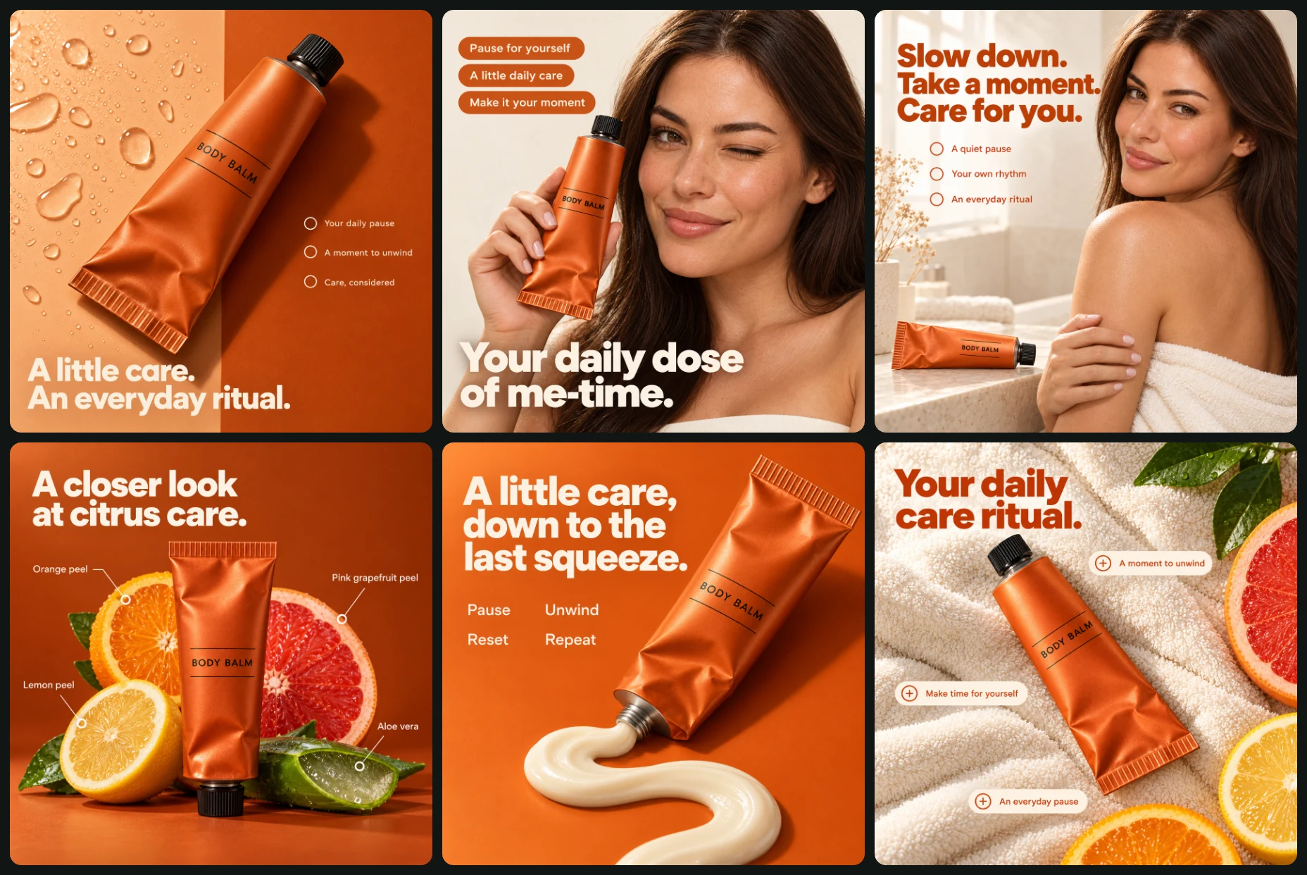
Create a coordinated six-image premium body-care campaign combining orange product studies, natural skin portraits, tactile cream texture, and an ivory towel flat lay. OPTIONAL CAMPAIGN INPUTS • Product photograph: [Attach if available] • Product details: [Optional] • Confirmed ingredients, fragrance notes, texture, and approved claims: [Optional] • Personal photograph for portrait designs: [Optional] • Approved campaign image: [Optional] • Approved replacement copy: [Optional] • Artwork language: [English by default] AUTOMATIC PRODUCT HANDLING Prioritize a separately supplied product photograph. Preserve silhouette, geometry, proportions, packaging format, material, closure or dispenser, colors, and recognizable non-brand label arrangement. If no photograph is supplied, use written details. If neither is supplied, use the fictional product defined below. Treat blank fields and unchanged placeholders as absent. Remove brand names, logos, websites, social handles, QR codes, certification marks, watermarks, and designer credits. Preserve package structure while removing branding. Use minimal generic labeling rather than dense pseudo-text. Do not invent ingredients, volume, nutrition, health effects, hydration performance, absorption speed, finish, fragrance, sustainability, recycling, vegan status, cruelty-free status, awards, prices, or other factual claims. FICTIONAL FALLBACK PRODUCT An original soft aluminum body-balm tube with a burnt-orange satin finish, a short black screw cap, fine black label rules, and the minimal generic label “BODY BALM.” Its fictional formulation is a dense warm-ivory citrus balm with orange peel, lemon peel, pink-grapefruit peel, and aloe vera. These invented ingredients and texture apply only to the fictional fallback. Do not transfer them to a supplied real product. Use this same tube geometry, cap, color, label arrangement, and cream appearance throughout all six designs. Reuse the first approved product depiction rather than reinventing it. REAL-PRODUCT INGREDIENT AND TEXTURE RULES For supplied products, show fruit, botanical ingredients, fragrance props, or dispensed texture only when confirmed. In design 4, if ingredients are unknown, replace fruit and aloe with translucent amber discs and curved ivory paper forms, and use the specified neutral headline and callouts. In design 6, if citrus ingredients or fragrance notes are unknown, replace citrus and leaves with an unbranded ivory ceramic dish and additional towel folds. In design 5, if texture is unknown, omit the dispensed ribbon. If the supplied package is rigid, preserve its original dispenser and show a stable diagonal package arrangement instead of a crushed tube. PERSONAL IDENTITY If a personal photograph is supplied, preserve recognizable facial features, skin tone, age, hairstyle, and defining characteristics. Adapt pose, wardrobe, and lighting to the brief. Otherwise create one original adult woman with straight dark-brown hair and natural makeup, intentionally recurring in designs 2 and 3. Do not copy the reference model’s exact identity. GLOBAL PALETTE • Burnt orange #B94712 • Tangerine #E86C20 • Apricot #F2B58B • Warm ivory #F4EFE5 • Near-black #24211E Preserve supplied product colors if different. Use the campaign palette in backgrounds, typography, and props. TYPOGRAPHY AND GRAPHIC SYSTEM Use a clean humanist sans-serif family throughout. Headlines are bold, compact, and left aligned unless otherwise specified. Supporting text is small but clearly readable. Use warm-ivory lettering on orange backgrounds and burnt-orange lettering on ivory backgrounds. Keep approximately 6% safe margins. Repeat fine annotation lines, restrained outlined circular markers, and slim rounded annotation capsules where specified. No certification-style seals, promotional badges, footer bars, logos, websites, or CTA buttons. LIGHTING AND PHOTOGRAPHY Maintain upper-left light direction throughout. Use stronger directional studio light for orange product studies and softer window or beauty light for portraits and towels. Render realistic aluminum folds, black cap geometry, natural skin pores, towel loops, fruit detail when permitted, and coherent contact shadows. Keep hero products and faces sharp. Avoid excessive smoothing, unnecessary blur, and artificial skin shine. CONSISTENCY WORKFLOW Generate design 1 first. Use its approved product depiction, orange palette, typography, and finish as references for later images. Continue using the original product photograph for identity. Approve the model identity in design 2, then reuse it in design 3. Keep the tube’s size relationships, label layout, cap, materials, and color consistent across product-only and portrait scenes. Use the same cream appearance in design 5 whenever a confirmed texture reference or fictional default supports it. Maintain consistent annotation type, capsule padding, line weights, and copy tone. NUMBERED DESIGN BRIEFS 1. CITRUS BODY BALM — HERO INTRODUCTION Use a vertically divided orange background: pale apricot on the left, deep burnt orange on the right. Place the tube diagonally through the center, cap toward upper right and crimped end toward lower left. Add clear water droplets to the left background plane, keeping the tube mostly dry. Use a subtle cast shadow and keep the label visible. Lower-left headline: “A little care. An everyday ritual.” Middle-right callouts: “Your daily pause” “A moment to unwind” “Care, considered” Use bold warm-ivory headline type, small matching callouts, and simple outlined circular markers. Use upper-left studio light, detailed tube folds, and a natural 70mm product perspective. 2. A PERSONAL CARE MOMENT Use a warm-ivory studio background. Crop the recurring adult woman from upper chest to just above the head, with her face on the right. She softly winks one eye and gives a relaxed subtle smile. She holds the upright tube beside her right cheek, appearing on viewer left, with its cap at the top and label facing the camera. Keep five fingers, a natural grip, and an unobstructed label. Use a discreet ivory strapless top. Upper-left orange capsules: “Pause for yourself” “A little daily care” “Make it your moment” Lower portrait headline: “Your daily dose of me-time.” Use small ivory capsule lettering and a bold warm-ivory headline with sufficient contrast. Keep text clear of eyes and label. Use soft upper-left beauty light, natural pores, and an 85mm perspective. 3. THE QUIET SKIN PORTRAIT Reuse the model from design 2. Use a warm-ivory bathroom or dressing-room setting with pale stone surfaces. Place her on the right two-thirds, torso turned away while looking back over her shoulder. Show head, upper back, and one bare shoulder. Use a securely wrapped ivory towel. Rest one hand gently across the opposite upper arm. Place a small horizontal product tube on a pale stone ledge at lower left. Add sparse neutral dried stems at far left, with botanical ingredient props only if confirmed. Upper-left headline: “Slow down. Take a moment. Care for you.” Supporting lines with small circular markers: “A quiet pause” “Your own rhythm” “An everyday ritual” Use burnt-orange typography, soft upper-left window light, realistic towel texture, and a 70–85mm perspective. 4. BOTANICAL PRODUCT STUDY Use a deep burnt-orange background and tabletop. Stand the tube upright at center with a clear contact shadow. For the fictional citrus default, arrange orange, lemon, and pink-grapefruit cross-sections vertically behind the tube, plus one cut aloe leaf. Keep the label unobstructed. Default headline: “A closer look at citrus care.” Default ingredient callouts: “Orange peel” “Lemon peel” “Pink grapefruit peel” “Aloe vera” Use fine annotation lines and circular markers, with two callouts on each side. Do not add ingredient-benefit claims. For a real product with confirmed ingredients, use only those ingredients and approved names. For a real product with no confirmed ingredients, replace fruit and aloe with translucent amber discs and curved ivory paper forms. Use: “A closer look at everyday care.” Neutral callouts: “The details” “The daily ritual” “A moment for you” “Care, considered” Use warm-ivory typography, upper-left directional light, and a natural 70mm product perspective. 5. THE LAST SQUEEZE Use a seamless tangerine background and surface. For the fictional tube, place a partially used package diagonally from upper right toward lower center. Its uncapped nozzle points down-left and touches the beginning of a thick warm-ivory cream ribbon. Shape the ribbon into a broad natural S across the lower foreground. Show consistent viscosity, rounded edges, contact shadows, and realistic aluminum creases. Keep the detached cap out of frame. Upper-left headline: “A little care, down to the last squeeze.” For a rigid supplied package, preserve the container and dispenser, use a stable diagonal arrangement, and change the last line to: “last detail.” If real-product texture is unknown, omit the cream ribbon. Middle-left editorial labels, arranged two by two: “Pause” “Unwind” “Reset” “Repeat” Use warm-ivory sans-serif. Do not place labels inside seals or certification-style icons. Use upper-left studio light and an elevated three-quarter 70mm perspective. 6. THE TOWEL-TOP RITUAL Photograph directly overhead. Arrange thick ivory terry towels in overlapping folds. Place the tube diagonally from upper left to lower right, black cap toward upper left, label visible. For the fictional citrus default, include a cropped pink-grapefruit half at the right edge, a lemon slice at lower right, an orange slice partly entering the bottom, and a few citrus leaves at upper right. For a real product, use only confirmed ingredient or fragrance props. If none are confirmed, replace the citrus and leaves with an unbranded ivory ceramic dish and additional towel folds. Upper-left headline: “Your daily care ritual.” Three slim ivory annotation capsules with burnt-orange text and tiny circular plus markers: “A moment to unwind” “Make time for yourself” “An everyday pause” Keep annotations horizontal and the product unobstructed. Use warm upper-left window light, detailed towel loops, natural tube creases, and soft coherent shadows. FINAL OUTPUT REQUIREMENTS Generate 6 separate finished images, one per numbered brief. Each image must have its own complete canvas. Do not combine them into a collage, grid, contact sheet, or multi-panel image. Use 1:1 square canvases throughout. If generation requires individual calls, generate sequentially using the same approved campaign references and original product photograph. Preserve all design-specific copy, compositions, props, conditional ingredient rules, and packaging requirements. Exclude the reference sheet’s outer borders, gutters, logos, certification icons, and presentation framing. Check readable typography, correct hands, coherent packaging, physical support, consistent lighting, and the absence of unsupported factual claims before completing each image.

All 6 images in this set

Each image has its own prompt. Tap an image to see it bigger.

Burnt orange body balm ritual

Create a premium skincare advertisement featuring a body-balm tube against a warm orange studio background. Output one finished 1:1 square image. OPTIONAL INPUTS • Product photograph: [Attach if available] • Product details and verified claims: [Optional] • Approved campaign image: [Optional] • Artwork language: [English by default] AUTOMATIC PRODUCT RULES Prioritize a separately supplied product photograph. Preserve its silhouette, proportions, packaging format, material, cap, colors, and recognizable non-brand label arrangement. Remove brand names, logos, websites, certification marks, and unsupported claims without redesigning the package. If no photograph is supplied, follow written details. Otherwise create an original soft aluminum body-balm tube with a burnt-orange satin finish, a short black screw cap, fine black label rules, and the minimal generic label “BODY BALM.” Do not invent ingredients, volume, certifications, or performance claims. Treat blank fields and unchanged placeholders as absent. COMPOSITION Use a vertically divided orange background: pale apricot on the left and deep burnt orange on the right. Position the tube diagonally through the center, black cap toward upper right and crimped end toward lower left. Keep the main label visible. Place a restrained field of clear water droplets on the left background plane. Keep the tube itself mostly dry. Use a subtle cast shadow behind it to create believable depth. Reserve the lower-left corner for the main headline and the middle-right area for three short callouts. TYPOGRAPHY AND EXACT COPY Lower-left headline: “A little care. An everyday ritual.” Use bold warm-ivory humanist sans-serif, left aligned in two lines. Right-side callouts: “Your daily pause” “A moment to unwind” “Care, considered” Use small warm-ivory sans-serif with simple outlined circular markers. No ingredient, hydration, absorption, or texture claims unless supplied and verified. CAMPAIGN SYSTEM Burnt orange #B94712, tangerine #E86C20, apricot #F2B58B, warm ivory #F4EFE5, near-black #24211E. Use clean humanist sans-serif typography, approximately 6% safe margins, fine annotation lines, and restrained circular markers. No logos, CTA buttons, footer bars, or websites. LIGHTING AND FINISH Directional upper-left studio light, a controlled satin highlight along the tube, detailed aluminum folds, crisp cap geometry, and soft realistic shadows. Use a natural 70mm product perspective. Keep the product and copy sharp. OUTPUT Generate one separate finished square advertisement. No reference-grid borders, presentation framing, dense pseudo-text, invented claims, extra packaging, or watermark.

Me time body balm beauty portrait

Create a premium skincare portrait advertisement showing an adult woman holding a body-balm tube beside her face. Output one finished 1:1 square image. OPTIONAL INPUTS • Product photograph or details: [Optional] • Personal photograph: [Optional] • Verified product claims: [Optional] • Approved campaign image: [Optional] AUTOMATIC PRODUCT AND IDENTITY RULES Use the supplied product photograph first, preserving its geometry, proportions, format, materials, cap, colors, and non-brand label arrangement. Remove branding, websites, certification marks, and unsupported claims. Otherwise follow written details. Default to an original burnt-orange satin aluminum tube with a short black screw cap, fine black label rules, and only “BODY BALM” as its generic label. Preserve a supplied person’s recognizable facial features, skin tone, age, hairstyle, and defining characteristics. Otherwise create an original adult woman with straight dark-brown hair and natural makeup. Do not copy the reference model’s exact identity. Blank inputs are absent. CORE CONCEPT AND COMPOSITION Use a warm-ivory studio background. Crop the woman from upper chest to just above her head. Position her face on the right, with one eye softly closed in a playful wink and a relaxed, subtle smile. She holds the upright tube beside her right cheek, appearing on viewer left, with its black cap at the top and front label facing the camera. Keep the hand natural, with five fingers and a relaxed grip. Avoid covering the main product label. Leave the upper-left area clear for three small orange capsules. Use a discreet ivory strapless top and natural skin texture. TYPOGRAPHY AND EXACT COPY Upper-left capsules: “Pause for yourself” “A little daily care” “Make it your moment” Use small warm-ivory sans-serif inside slim tangerine rounded capsules. Across the lower portrait: “Your daily dose of me-time.” Use bold warm-ivory humanist sans-serif with sufficient contrast against the image. Keep text away from the eyes and product label. CAMPAIGN SYSTEM Burnt orange #B94712, tangerine #E86C20, apricot #F2B58B, warm ivory #F4EFE5, near-black #24211E. Use approximately 6% margins and match any approved campaign image’s typography and grading. LIGHTING AND CAMERA Soft upper-left beauty light, gentle facial modeling, realistic pores, restrained skin sheen, detailed hair, and a natural 85mm portrait perspective. Keep the face and tube equally clear. Do not use artificial skin smoothing or imply before-and-after results. OUTPUT Generate one standalone square advertisement. No logos, websites, extra products, invented benefit claims, distorted fingers, or presentation borders.

A quiet body care ritual

Create a refined skincare advertisement combining a shoulder portrait, a small product still life, and editorial typography. Output one finished 1:1 square image. OPTIONAL INPUTS • Product photograph or details: [Optional] • Personal photograph: [Optional] • Verified product claims: [Optional] • Approved campaign image: [Optional] AUTOMATIC RULES Preserve the exact format, geometry, proportions, material, colors, cap, and non-brand label arrangement of a supplied product. Remove brands, logos, websites, badges, and unsupported claims. Otherwise follow written details. The default is an original burnt-orange satin aluminum body-balm tube with a short black screw cap, fine black label rules, and only “BODY BALM.” Preserve a supplied person’s identity, age, skin tone, hairstyle, and defining features. Otherwise create an original adult woman with straight dark-brown hair. If an approved companion portrait is supplied, reuse that model intentionally. Blank placeholders are absent. COMPOSITION Use a warm-ivory bathroom or dressing-room setting with pale stone surfaces. Position the woman on the right two-thirds, turned away at the torso while looking back toward the camera over her shoulder. Show the head, upper back, and one bare shoulder. She wears a securely wrapped ivory towel. Rest one hand gently across the opposite upper arm with natural anatomy. Keep her expression calm and confident. Place a small horizontal body-balm tube on the pale stone ledge at lower left, clearly recognizable but secondary to the portrait. Reserve the upper-left third for a compact headline and three short supporting lines. Add a sparse arrangement of neutral dried stems at far left; do not use botanical ingredient props unless confirmed appropriate. TYPOGRAPHY AND EXACT COPY Upper-left headline: “Slow down. Take a moment. Care for you.” Use bold burnt-orange humanist sans-serif with close line spacing. Below, with small circular markers: “A quiet pause” “Your own rhythm” “An everyday ritual” Use small burnt-orange sans-serif. Do not add absorption, skin-feel, or all-season claims unless verified. CAMPAIGN SYSTEM Burnt orange #B94712, tangerine #E86C20, apricot #F2B58B, warm ivory #F4EFE5, near-black #24211E. Maintain approximately 6% margins and consistent campaign typography. LIGHTING AND CAMERA Soft upper-left window light, realistic skin texture, gentle shoulder highlights, tactile towel fibers, and subtle stone reflections. Use a natural 70–85mm portrait perspective. Keep the face and small product identifiable. OUTPUT Generate one separate square advertisement. Avoid suggestive posing, exaggerated skin retouching, distorted hands, invented claims, branding, and contact-sheet framing.

Citrus and aloe body balm

Create a premium skincare product advertisement using a central body-balm tube, ingredient-style callouts, and a vivid orange studio composition. Output one finished 1:1 square image. OPTIONAL INPUTS • Product photograph or details: [Optional] • Confirmed ingredients and approved ingredient descriptions: [Optional] • Approved campaign image: [Optional] AUTOMATIC PRODUCT AND INGREDIENT RULES Preserve a supplied product’s shape, proportions, packaging format, cap, materials, colors, and non-brand label arrangement. Remove branding, websites, certification marks, and unsupported claims. Otherwise follow written details. If neither a product photograph nor written details are supplied, create a fictional citrus body balm in a burnt-orange satin aluminum tube with a short black screw cap, fine black label rules, and only “BODY BALM.” Define its fictional botanical styling as orange peel, lemon peel, pink grapefruit peel, and aloe vera. These fictional ingredients apply only to this fallback product. For a supplied real product, use only confirmed ingredients. Never infer ingredients from packaging color. If no ingredients are confirmed, replace fruit and leaves with translucent amber discs and curved ivory paper forms, and use the neutral copy below. COMPOSITION Use a deep burnt-orange background and matching tabletop. Stand the tube upright at center, black cap at the top, with a clear contact shadow beneath it. For the fictional citrus default, arrange orange, lemon, and pink-grapefruit cross-sections behind the tube in a vertical sequence, with one cut aloe leaf extending beside it. Keep the product label unobstructed. Place two short callouts on either side, linked with fine lines and circular markers. For real products, substitute only confirmed ingredient props. Match the number of callouts to confirmed information; omit unsupported ones. TYPOGRAPHY AND EXACT COPY For the fictional citrus default: Headline: “A closer look at citrus care.” Callouts: “Orange peel” “Lemon peel” “Pink grapefruit peel” “Aloe vera” Do not attach unverified benefits to these ingredient names. For a real product with no confirmed ingredients: Headline: “A closer look at everyday care.” Callouts: “The details” “The daily ritual” “A moment for you” “Care, considered” Use bold warm-ivory humanist sans-serif for the headline and smaller matching sans-serif for callouts. CAMPAIGN SYSTEM Burnt orange #B94712, tangerine #E86C20, apricot #F2B58B, warm ivory #F4EFE5, near-black #24211E. Maintain 6% margins, fine annotation lines, and consistent marker sizes. LIGHTING AND FINISH Directional upper-left light, richly textured fruit only when permitted, translucent aloe detail when applicable, realistic tube folds, and controlled shadows. Use a natural 70mm product perspective with sharp hero-product focus. OUTPUT Generate one standalone square advertisement. No invented real-product ingredients, benefit claims, logos, badges, websites, or grid borders.

Burnt orange body balm squeeze

Create a tactile skincare advertisement featuring an opened body-balm tube dispensing a thick cream ribbon onto an orange surface. Output one finished 1:1 square image. OPTIONAL INPUTS • Product photograph or details: [Optional] • Confirmed product texture: [Optional] • Approved supporting copy: [Optional] • Approved campaign image: [Optional] AUTOMATIC PRODUCT RULES Preserve the supplied package’s format, geometry, material, colors, cap mechanism, and non-brand label arrangement. Remove branding, websites, certification badges, and unsupported claims. Do not turn a rigid bottle into a collapsible tube. If no photograph is supplied, follow written details. Otherwise create an original burnt-orange satin aluminum body-balm tube with a short black screw cap, fine black label rules, and only “BODY BALM.” For the fictional default, use a dense warm-ivory balm. For a real product, match its supplied texture reference or description. If texture is unknown, omit the dispensed ribbon and show the open package instead. If the supplied container is rigid, retain its original dispenser and place it in a stable diagonal arrangement rather than crushing it. Treat blank fields as absent. CORE CONCEPT AND COMPOSITION Use a seamless tangerine-orange background and surface. For the fictional tube, position the partially used package diagonally from upper right toward lower center. The uncapped nozzle points down-left and touches the beginning of a thick, glossy cream ribbon. Form the ribbon into a broad, natural S-shaped path across the lower foreground, with rounded edges, consistent viscosity, and believable contact with the surface. Show realistic aluminum creases rather than chaotic crushing. Keep the detached black cap out of frame. Reserve the upper-left area for the headline and the middle-left for four compact editorial labels. TYPOGRAPHY AND EXACT COPY Headline: “A little care, down to the last squeeze.” For a rigid supplied package, replace the final line with: “last detail.” Below, arrange four small text labels in a two-by-two layout: “Pause” “Unwind” “Reset” “Repeat” Use bold warm-ivory humanist sans-serif for the headline and smaller regular sans-serif for the labels. These are decorative editorial words, not certification badges; do not place them inside seals or icons. CAMPAIGN SYSTEM Burnt orange #B94712, tangerine #E86C20, apricot #F2B58B, warm ivory #F4EFE5, near-black #24211E. Maintain 6% margins and match the campaign type character. LIGHTING AND CAMERA Use upper-left studio light, dimensional cream highlights, realistic aluminum reflections, and coherent cast shadows. Photograph from a moderately elevated three-quarter angle with a natural 70mm perspective. OUTPUT Generate one separate square advertisement. Do not invent recyclable-packaging, cruelty-free, vegan, botanical, or sustainability claims. No logos, websites, badges, unsupported texture depiction, or presentation framing.

A citrus body balm ritual

Create a premium skincare flat-lay advertisement featuring a body-balm tube resting diagonally on ivory towels. Output one finished 1:1 square image. OPTIONAL INPUTS • Product photograph or details: [Optional] • Confirmed ingredients or fragrance notes: [Optional] • Approved campaign image: [Optional] AUTOMATIC PRODUCT AND PROP RULES Use a supplied product photograph first, preserving silhouette, proportions, packaging format, material, cap, colors, and non-brand label arrangement. Remove brands, logos, websites, certification marks, and unsupported claims. Otherwise follow written details. The fictional default is a citrus body balm in a burnt-orange satin aluminum tube with a short black screw cap, fine black label rules, and only “BODY BALM.” For this fictional default, orange, lemon, and pink-grapefruit peel are defined ingredients, and citrus foliage may be used as styling. For a supplied real product, use citrus or other botanical props only when the relevant ingredients or fragrance notes are confirmed. Otherwise replace them with an unbranded ivory ceramic dish and additional towel folds. Never infer fragrance from color. Blank placeholders are absent. COMPOSITION Photograph directly overhead. Arrange thick ivory terry towels in soft overlapping folds across the canvas. Lay the tube diagonally from upper left to lower right, black cap toward upper left, with its front label clearly visible. For the fictional citrus default, place a cropped pink-grapefruit half at the right edge, a lemon slice near lower right, an orange slice partly entering the bottom edge, and a few glossy citrus leaves at upper right. Keep the arrangement sparse and the tube unobstructed. Place a short headline at upper left. Add three small annotation capsules around the product with tiny circular plus markers. Keep all annotations horizontal and readable. TYPOGRAPHY AND EXACT COPY Headline: “Your daily care ritual.” Annotation capsules: “A moment to unwind” “Make time for yourself” “An everyday pause” Use burnt-orange humanist sans-serif. Set annotations inside slim warm-ivory capsules with orange text. These are editorial phrases, not product-benefit claims. CAMPAIGN SYSTEM Burnt orange #B94712, tangerine #E86C20, apricot #F2B58B, warm ivory #F4EFE5, near-black #24211E. Maintain approximately 6% margins and consistent annotation styling. LIGHTING AND FINISH Use warm upper-left window light, soft leaf shadows when applicable, detailed towel loops, natural tube creases, and restrained fruit moisture. Keep the flat lay crisp with realistic contact shadows. OUTPUT Generate one standalone square advertisement. No brands, websites, invented ingredients, fragrance claims, benefits, certifications, or contact-sheet borders.