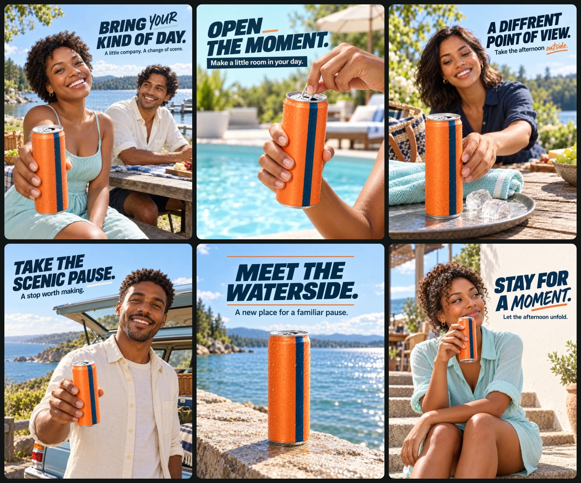
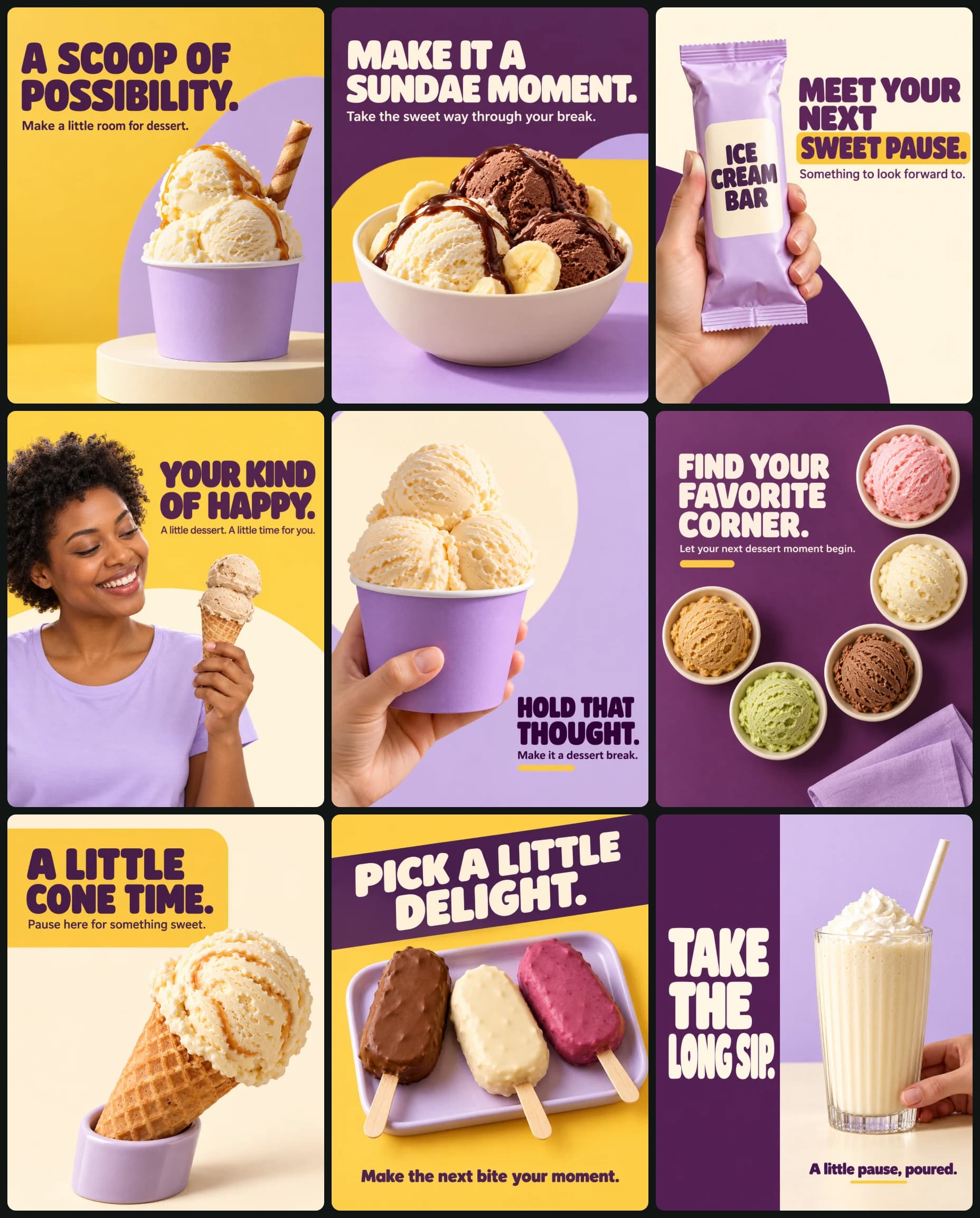
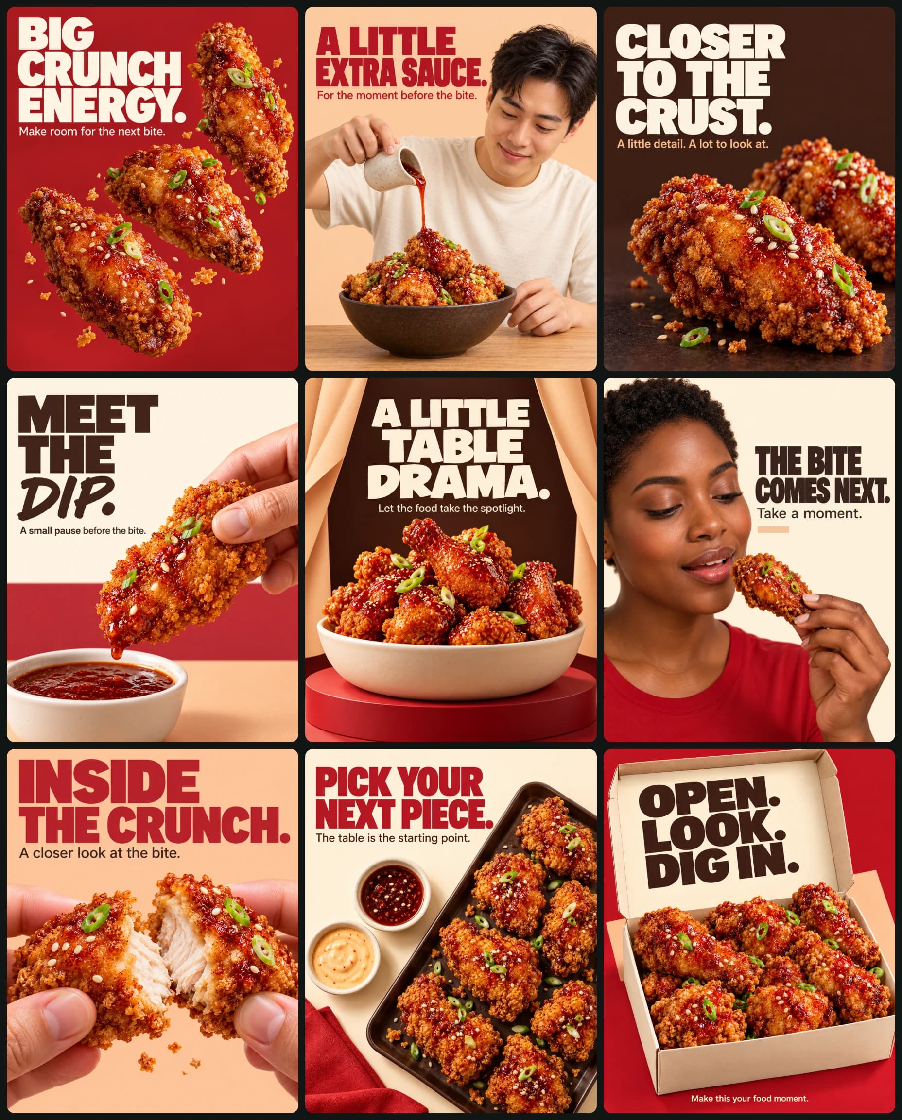
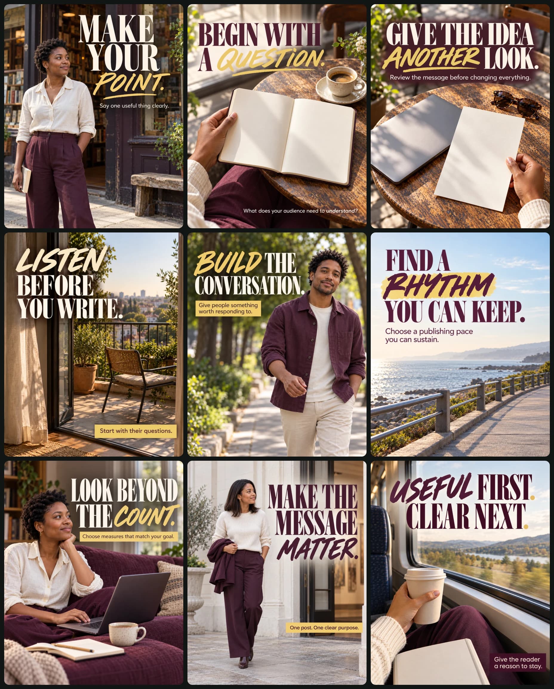
Create a coordinated six-image automotive parts-and-lubricants social media campaign.
CREATIVE OBJECTIVE
Preserve the reference’s technical confidence, strong product presentation, clear information hierarchy, and dependable automotive retail character.
Build a new visual identity through fresh compositions, typography, graphic shapes, and copy. Use color and type that support mechanical precision and trust while remaining energetic and readable.
OUTPUT
Generate 6 separate finished images, one per numbered brief.
Each image must have its own complete 4:5 portrait canvas.
Do not combine them into a collage, grid, contact sheet, or multi-panel image.
If necessary, generate the images sequentially.
Deliver flat finished artwork without a monitor, computer, software interface, screen perspective, presentation border, or surrounding room.
OPTIONAL INPUTS
• Product and component photographs
• Confirmed product descriptions and specifications
• Confirmed vehicle compatibility
• Approved replacement copy
• Approved brand assets
Treat blank fields as absent. Never render placeholders.
INPUT PRIORITY
Supplied photographs first, confirmed written descriptions second, fictional defaults third.
Preserve actual packaging shapes, handles, caps, materials, colors, component geometry, and verified non-brand technical labels.
Remove existing logos unless explicitly approved. Do not redesign supplied products.
If only one product is supplied, feature that product rather than inventing additional variants or a range.
TECHNICAL ACCURACY
Do not invent viscosity grades, fluid chemistry, manufacturer approvals, vehicle compatibility, specifications, part numbers, performance benefits, safety outcomes, certifications, stock availability, prices, discounts, contact information, or service guarantees.
For fictional defaults, use only the neutral product labels specified below.
CAMPAIGN IDENTITY
Deep graphite: #202831
Safety amber: #FFBB28
Cool white: #F3F5F4
Steel gray: #AAB4BB
Use graphite for technical authority, amber for emphasis, white for clarity, and steel gray for supporting structure.
Keep product colors faithful to supplied photographs. Adjust the surrounding graphic balance to complement those colors.
TYPOGRAPHY
Bold squared sans-serif headlines with open counters.
Clean regular or medium-weight sans serif for supporting copy.
Clear size contrast, deliberate line breaks, and approximately 6% safe margins.
No distorted lettering, tiny unreadable paragraphs, or excessive text effects.
GRAPHIC LANGUAGE
Broad rectangular panels, bracket shapes, shallow diagonal bands, fine parallel rules, and small square junctions.
Use disciplined alignment and intentional empty space. Vary the composition between posts while retaining the same visual identity.
Avoid copying the reference’s blue-and-white palette, giant background initials, exact product placement, messaging-platform centerpiece, or repeated contact footer.
PHOTOGRAPHIC DIRECTION
For product-based designs, use the visual character of a full-frame studio camera, such as a Nikon Z7 II, with a 70–85mm lens, approximately f/8, ISO 100, 1/160 second, and neutral white balance near 5200K.
These are visual guides, not text to print.
Use a large diffused key from upper left, broad overhead diffusion where needed, restrained white bounce, and black flags to control reflections and edge definition.
Render molded plastic, rubber, pleated filter material, and machined metal differently and believably.
Maintain coherent scale, perspective, light direction, material reflections, and contact shadows.
Keep important product details resolved without harsh sharpening. Allow gentle detail falloff with depth.
Avoid HDR halos, exaggerated microcontrast, glossy CGI surfaces, artificial glow, smoke, sparks, oil splashes, atmospheric haze, heavy grain, and floating unsupported objects.
Graphic-only design 5 must remain clean and flat, without simulated photographic defects.
ARTWORK COPY
Use only the exact English copy specified below.
Do not add invented branding, labels, contact strips, promotional badges, QR codes, or watermarks.
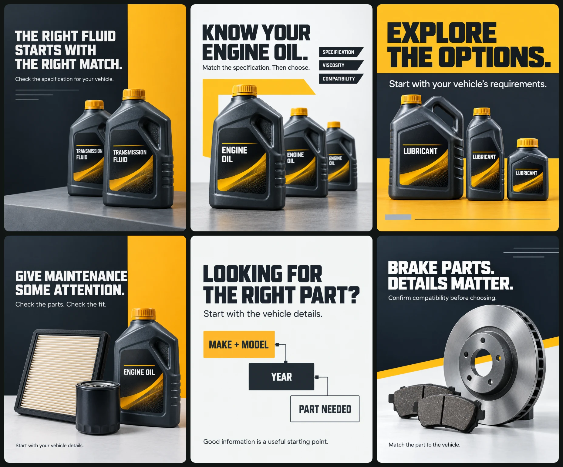
DESIGN 1 — TRANSMISSION FLUID
Graphite background with a broad amber vertical panel occupying the right third.
Place two matching transmission-fluid bottles in the lower-right half, one forward and one behind, resting on a low steel-gray plinth.
Fictional fallback: graphite bottles, amber caps, plain labels reading only:
“TRANSMISSION FLUID”
White headline at upper left:
“THE RIGHT FLUID
STARTS WITH
THE RIGHT MATCH.”
Supporting copy:
“Check the specification for your vehicle.”
Add three abstract fine horizontal rules of different lengths beneath the supporting copy. Do not imply technical data.
DESIGN 2 — ENGINE OIL SELECTION
Cool-white background.
Place one large engine-oil container slightly left of center in the lower two-thirds, with two smaller containers receding toward the right, all on one continuous photographed surface.
Fictional fallback labels:
“ENGINE OIL”
Graphite headline:
“KNOW YOUR
ENGINE OIL.”
Supporting copy:
“Match the specification. Then choose.”
Behind the products, add a broad amber bracket shape open toward the right.
Place three small graphite caption tabs in the open right-side space:
“SPECIFICATION”
“VISCOSITY”
“COMPATIBILITY”
These are general selection topics. Do not attach unsupported attributes to individual bottles.
DESIGN 3 — LUBRICANT RANGE
Amber background with a large graphite horizontal panel across the middle.
Arrange supplied lubricant products along the lower edge of the panel, fully visible and grounded on one surface.
If only one product is supplied, show it once.
Fictional fallback: three plausible unbranded lubricant containers with neutral labels:
“LUBRICANT”
Graphite headline in the upper quarter:
“EXPLORE
THE OPTIONS.”
White supporting copy within the graphite panel:
“Start with your vehicle’s requirements.”
Add a small steel-gray rectangle at lower left and one fine graphite rule near the bottom.
DESIGN 4 — MAINTENANCE ESSENTIALS
Graphite background with an amber L-shaped graphic behind the product arrangement.
Place maintenance products across the lower half on a cool-white workbench.
Fictional fallback:
One unbranded engine-oil bottle at viewer right.
One pleated panel air filter leaning securely at left.
One plain cylindrical oil filter in front.
Do not imply these fit one vehicle or form a verified service kit.
White headline at upper left:
“GIVE MAINTENANCE
SOME ATTENTION.”
Supporting copy:
“Check the parts. Check the fit.”
Small lower-left caption:
“Start with your vehicle details.”
DESIGN 5 — PARTS ENQUIRY
Primarily flat graphic design on a cool-white background.
Graphite headline in the upper third:
“LOOKING FOR
THE RIGHT PART?”
Supporting copy:
“Start with the vehicle details.”
Arrange three offset graphic cards in a descending sequence:
1. Amber card, graphite text:
“MAKE + MODEL”
2. Graphite card, white text:
“YEAR”
3. White card with a thin graphite border:
“PART NEEDED”
Connect the cards with a fine graphite line and small square junctions. Maintain clean alignment and generous spacing.
Bottom copy:
“Good information is a useful starting point.”
No messaging logos, phone mockups, fake chat screenshots, invented contacts, or response-time promises.
DESIGN 6 — BRAKE COMPONENTS
Graphite upper 60%, cool-white lower 40%, separated by a shallow diagonal amber band.
Place one brake disc upright on the lower surface, slightly right of center and securely supported. Arrange a pair of brake pads naturally in front.
Use supplied components exactly.
Fictional fallback:
One generic plain ventilated brake disc and a pair of generic brake pads, presented only as a category illustration.
White headline at upper left:
“BRAKE PARTS.
DETAILS MATTER.”
Supporting copy:
“Confirm compatibility before choosing.”
Small graphite caption on the white area:
“Match the part to the vehicle.”
Add fine abstract parallel lines near the upper-right edge.
Maintain correct circular perspective, disc thickness, component scale, and contact shadows.
FINAL CHECK
Deliver six separate portrait artworks.
Keep every headline readable and accurately spelled.
Maintain a consistent campaign identity with six distinct compositions.
Preserve supplied products and verified technical details.
Do not add unsupported claims or specifications.
Prioritize clarity, trustworthy presentation, and believable product photography.