Food Ads
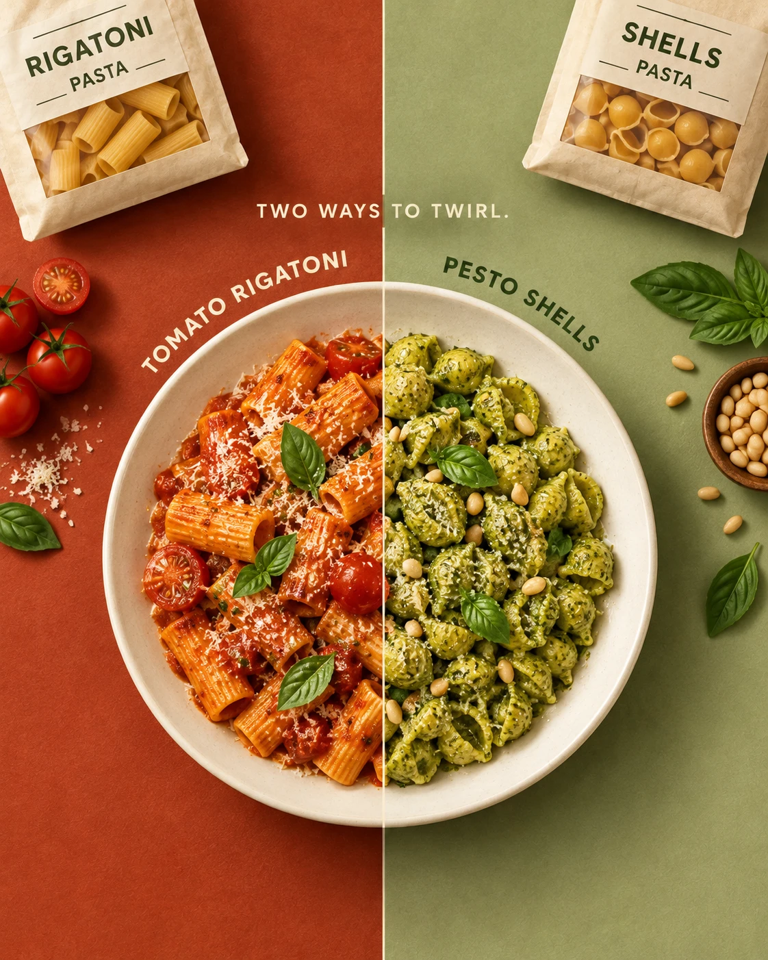
Two Ways Pasta Food Ad
3:40 likesFood AdsCinematic
Prompt
Create a striking overhead pasta advertisement built around a precise vertical split: two pasta shapes, two complementary sauces, and two coordinated background colors forming one unified composition.
The core idea is variety within one product category. Preserve the mirrored comparison and the relationship between each package, prepared pasta, and supporting ingredients.
OPTIONAL SETTINGS
• Products: [Use supplied pasta packs or details]
• Default left: [Rigatoni in tomato sauce]
• Default right: [Small pasta shells in basil pesto]
• Left palette: [Warm brick red]
• Right palette: [Pale pistachio]
• Aspect ratio: [4:5 portrait]
AUTOMATIC PRODUCT RULES
If two pasta references are supplied, use those exact shapes and packaging formats. Remove brand names and logos, preserving generic shape names.
If one pasta product is supplied, show that same shape in two sauce preparations and label the preparations accurately.
If neither is supplied, create generic rigatoni and shell-pasta packs. Each cooked pasta must match the shape visible in its corresponding package. Do not invent heritage dates, certifications, cooking times, or weights.
COMPOSITION
Divide the canvas into equal vertical halves with a very thin ivory dividing line.
Create a seamless visual composite of two overhead white plates: the left half contains tomato rigatoni and the right half contains pesto shells. Align their rims perfectly so they read as one large circular plate centered across the split.
The plate occupies approximately 70% of the canvas width and sits slightly below the midpoint. The division between recipes is sharp and graphic, not a physical partition placed inside the plate.
Place one pasta pack diagonally at the upper-left corner and the other at the upper-right. Crop only nonessential outer portions, preserving the product names and transparent pasta windows.
PACKAGING
Use simple cream packages with dark olive generic typography and a clear window revealing dry pasta.
Do not reproduce reference brand lettering, heraldic emblems, or historical seals. Keep the package styling coordinated.
TEXT
Small centered heading above the plate:
“TWO WAYS TO TWIRL.”
Curved label above the left plate half:
“TOMATO RIGATONI”
Curved label above the right plate half:
“PESTO SHELLS”
Adapt these labels to supplied products. Use bold uppercase sans-serif lettering following the plate’s outer curve, with enough clearance from the rim.
Use ivory text over the brick-red side and deep olive over the pistachio side.
FOOD AND PROPS
Left: ridged rigatoni lightly coated in tomato sauce, with cherry-tomato halves, grated cheese, and a few basil leaves.
Right: small shell pasta coated in textured basil pesto, with a restrained scattering of pine nuts and fresh basil.
Place tomatoes, basil, and a small cheese scatter on the left background. Place basil leaves and a small pine-nut cluster on the right. Keep ingredients specific to each preparation.
Leave deliberate gaps between props rather than filling every empty area.
LIGHTING
Use consistent soft daylight from the upper left across both halves. Match plate scale, perspective, shadow direction, and white balance exactly.
Render crisp pasta ridges, realistic sauce coverage, individual nuts, and natural leaf texture. Avoid a mismatch where one half appears photographed from a different angle.
Preserve the reference’s split-color layout and continuous plate illusion. Change background shades, package angles, garnish placement, and wording subtly.
Output one complete portrait advertisement without logos, excessive copy, distorted plate seams, or watermarks.